As his new book, More Beautiful, debuts, we speak to Mark D. Sikes about blending the best of both coasts across his house projects
Words by ANDREW BARKER
As the basis for his decorating style, Mark D. Sikes — who designed Oscar winner Reese Witherspoon’s Nashville residence and rom-com master Nancy Meyers’ home in the Pacific Palisades — looked to his childhood. He distilled the classic homes of his Southern and Midwest upbringing down to their quintessence, adding a heavy splash of maritime blue, and then drew heavily on the tastes of the legendary figures whose style he admired as a young man, designers such as Oscar de la Renta and Bill Blass, and style icons Jackie Kennedy and Marella Agnelli.
“I think every great style icon has their own sense of style; they know who they are and what they like, and that resonates throughout their lives and work,” Sikes says. “I’ve never really thought of this before, but like these stylish figures I admire, I’ve always had my own sense of style: I wear mostly navy, and what I love today is what I have always loved — blue and white, stripes, wicker, big white houses, manicured gardens.”
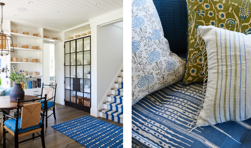
Left: In a Portola Valley home, a soapstone sink seems age-old in the mudroom. It’s an idyllic place for cutting flowers. Right: In a seating area in the same home, hues of flax, olive, green and denim blue exude an organic feel in a country home, even in ornate patterns.
More Beautiful: All-American Decoration (Rizzoli New York, $45), Sikes’ second book, shares homes he has designed across the U.S., both coastal and country, including a whole section on the designer’s own Hollywood Hills residence. A veritable coffee-table tome, it takes a leaf out of the scrapbook with annotations and quotations to inspire the readers to up the glamour of their interiors game.
Here, we hear from the east-meets-west master-decorator himself.
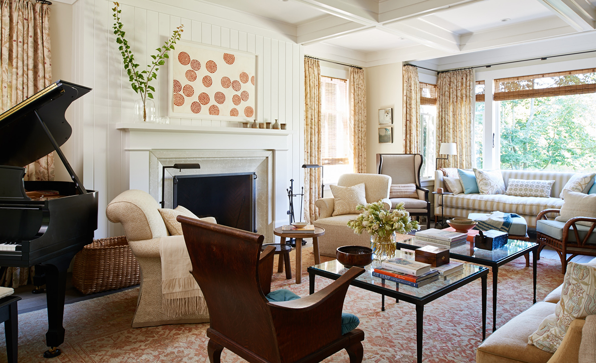
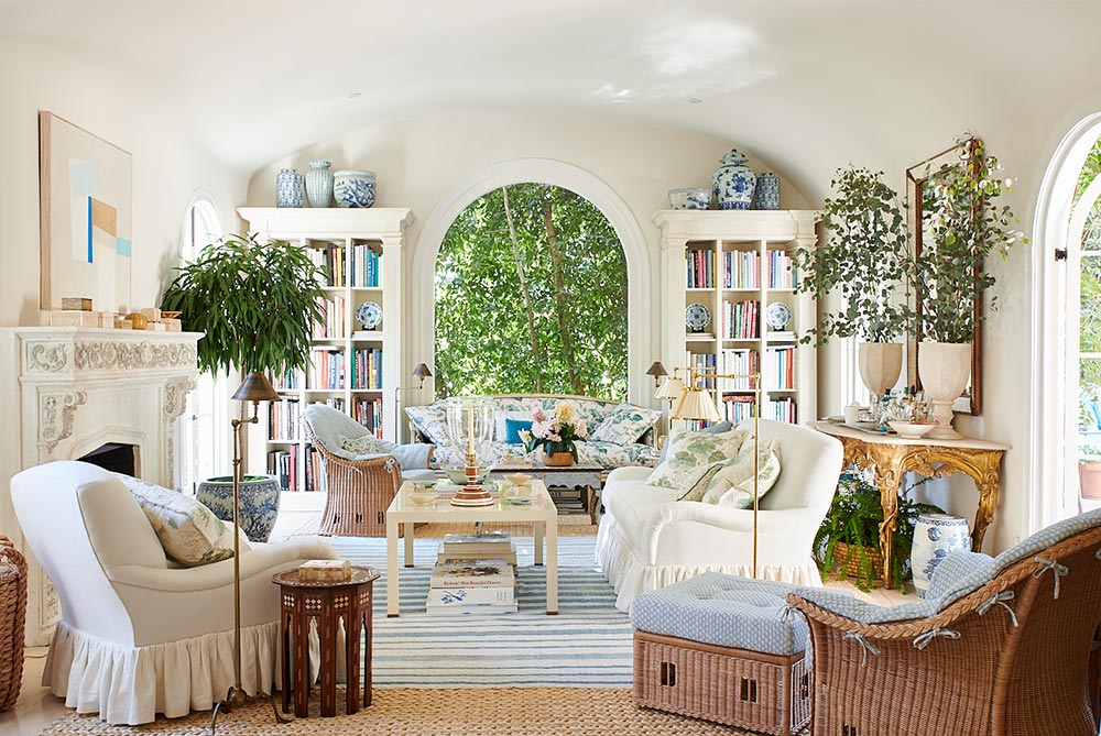
In the Portola Valley residence, the warm tones in muted antique carpet and neutral-on-neutral patterns echo the light in this sun-drenched living room.
Define your decorating style.
Timeless, classic, all-American and beautiful.
As you started out, who was your biggest influence?
Bunny Williams — she’s a dear friend. She’s kind, smart, gracious and down-to-earth. She’s also the best female interior designer in the world.
What would you say was your big break?
My Hollywood Hills home being featured in House Beautiful in December 2011, and then my NYC Kips Bay dining room in 2015.
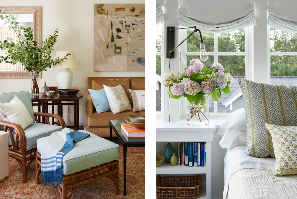
Left: In the Portola Valley home, neutrals and chestnuts combine for an earthy look, just like the landscape beyond the windows. The modern art piece ties each hue in the sitting area together. Right: In the same home, fresh hydrangea cuttings ensure guests awake to a farm-fresh moment of beauty.
How has your style evolved?
It has become more casual and simple over the years. I stick with what works, and I always love a touch of the unexpected in both fashion and my interiors.
How does your new book, More Beautiful, differ from your previous one, Beautiful?
More Beautiful is a continuation of the story in Beautiful. The first book was broken up by color stories; this book is broken up by styles of homes. But what I think is so special about this book is the message that beauty is powerful. In the midst of so much uneasiness, it can unite and help heal us — I truly believe it can help change us. It doesn’t matter what religion you are, your education, how old you are, where you come from or what you have, beauty can and will connect us all. Might sound silly, but I want to start a Beautiful movement! We need it!
Which is your favorite California property you have worked on and why?
A project that overlooks Butterfly Beach in Montecito. Why? Because I want to live there.
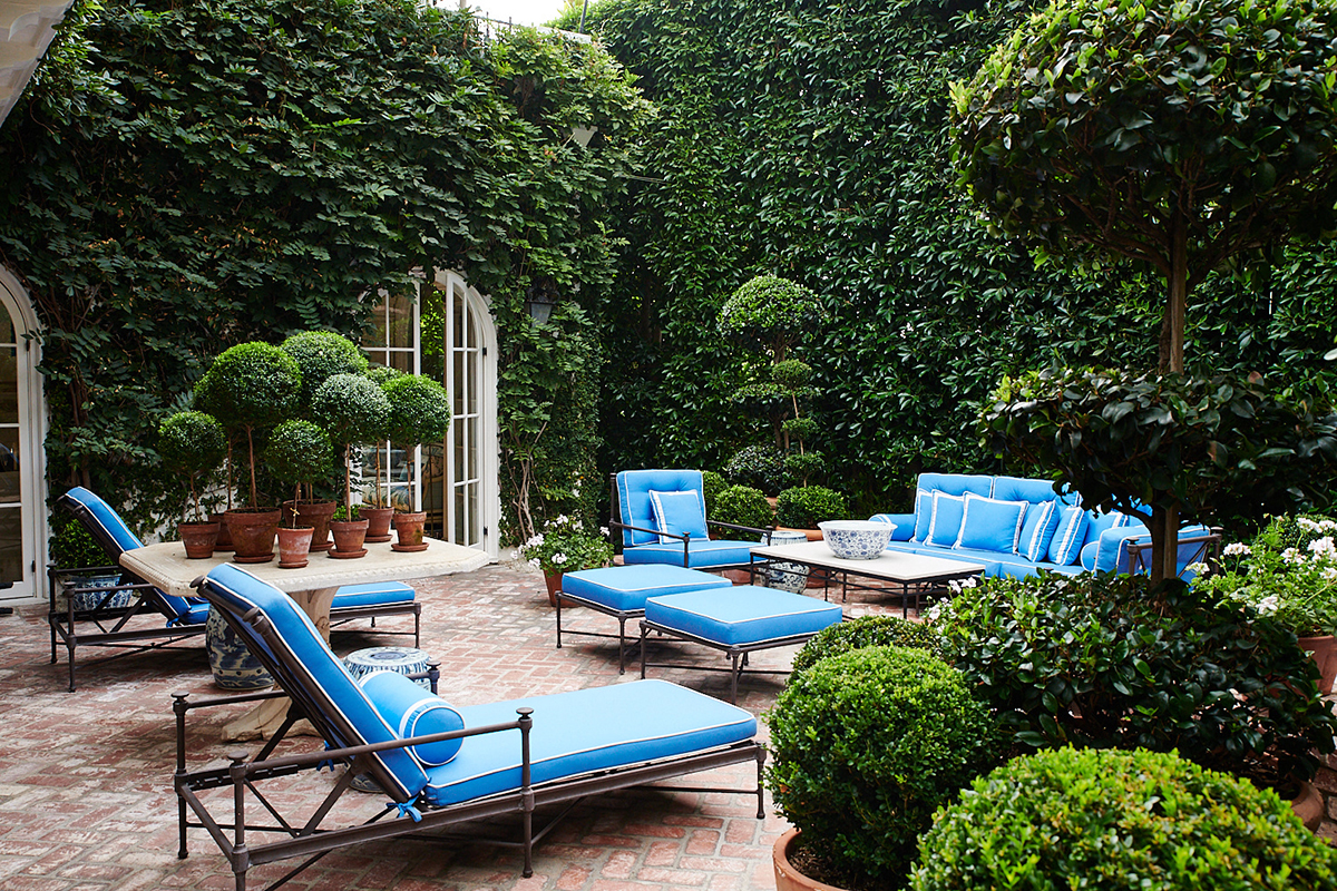
At MARK D. SIKES’ Mediterranean-style home in West Hollywood, the designer reupholstered the cushions of the furniture in a vibrant new cobalt blue and buttoned-up white piping to add a splash. The hues seem to make the surrounding ficus hedges and topiaries all the more luscious.
How do you approach a West Coast project compared to an East Coast project?
I’m always inspired by the architecture and the outdoors that surrounds a project. The architecture inspires the mood and aesthetic, the outdoors inspires the color palette and the finishes. Somehow East Coast projects always end up feeling more traditional and formal, and West Coast projects a bit more casual and easy. My job is to mix it up and bring the West Coast east and East Coast appropriateness to all of our projects.
“Bringing the outdoors in is vital for human happiness — as evidenced by the parade of lush myrtle topiaries flanking the doors to the garden,” MARK D. SIKES writes of his West Hollywood residence, which boasts Hollywood Regency details.
How does the weather influence specific choices of fabrics?
Stereotypically, linen, cotton and batiks feel more warm-weather appropriate, and wools, chenilles and leather feel better in homes in the north. But I always think it’s more interesting, inviting and stylish to go against the grain and ensure there’s a great mix of fabrics throughout a home. Take a peek at More Beautiful and you will see how we do it.
Which colors work best in California?
Blue, of course.
Complete this sentence: Good interior design is …
… always beautiful, but when it’s great, it’s more beautiful!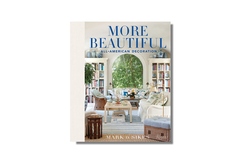
Feature image: In the Portola Valley residence, a range of greens form a natural accompaniment to blues and flax hues, colors culled from the gardens outside. All photos by Amy Neunsinger, as seen in More Beautiful: All-American Decoration (Rizzoli New York, $45) by Mark D. Sikes.
A version of this story originally appeared in the September 2020 issue of C Magazine.
Discover more DESIGN news.

