From hills to canyons, these indoor-outdoor homes blend tradition and modernity
Words by WILLIAM HEFNER
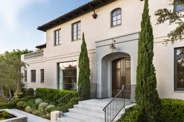
French provincial gardens provided inspiration for the landscape around the house. We emphasized the sculptural volumes of hedges and rounded topiary in varying shades of green, along with a formal reflecting pool. The organic shapes of old-growth olive trees relax the overall feeling and give the house a local context. Photography by LAURA HULL (Avignon).
Over the past three decades, I’ve been privileged to design houses in all the historical and modern styles that populate this cinematic landscape of canyons, palisades, and grand old Hollywood neighborhoods. I’ve welcomed new opportunities to work in more country and rustic idioms, on larger sites, with more land to play with. The projects overall have gotten bigger — if not always in size, then certainly in ambition. They’re more challenging in site planning and construction; in the sculpting of buildings to take best advantage of landscape and views, while being beautiful forms themselves. Gardens, pools, outbuildings, and native land restoration have become more central to each home. I’ve been able to draw on the strengths of a team with more specialized expertise in craft, engineering, and horticulture, allowing us to continually push the boundaries of what we can do — not just aesthetically, but also materially and technically.
Most interesting, though, has been the growing interest in more adventurous modern design among our clients and in the culture here generally. This is not just an appetite for European modern classicism, or the quintessential midcentury architecture of Los Angeles. The desired houses are about individualism, luxury, and bespoke character, even as they prize a kind of simplicity. They express something quite local, influenced by California’s abundant beauty, iconic geographies, environmental sensitivity, and, of course, the sensational climate and light; virtually all are instilled with the DNA of indoor-outdoor living. This kind of house may fall under the umbrella of “contemporary,” though I prefer to think of our work as a new modern. It’s referential but it has less revival, less genre, in it. Oftentimes we create a hybrid that’s more traditional on the outside, with the modern on the inside.
In Los Angeles as well as the countryside, another phenomenon is that more people from outside the area are coming here to build holiday homes. That, too, has affected the sense of play, internationalism, and cultural preference that we are afforded when creating California homes. Overall, there is an exciting new feeling of collaborative risk worth taking, to work outside of comfort zones and prior norms.
The local design community has been ripe for this evolution. And it’s yielded a new generation of homes for us in a very short period of time. We’ve gotten more sophisticated, more serious in a sense.
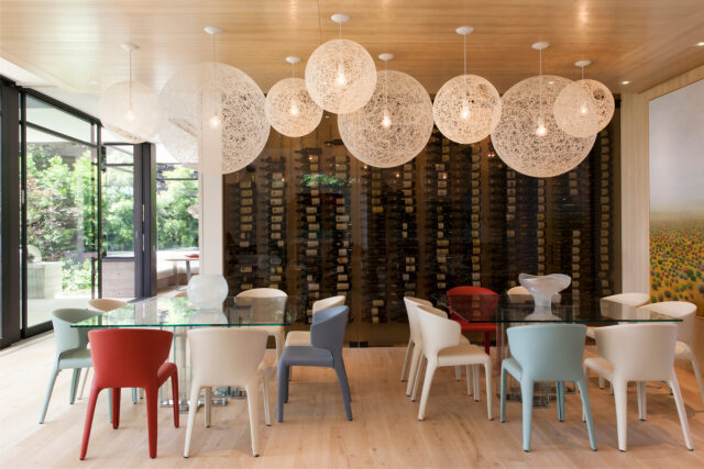
In the dining room area, part of the husband’s wine collection is showcased behind tinted glass doors—allowing a separate, conditioned wine cellar to become an artful and participatory display. Anticipating large to small gatherings, we chose two tables instead of one long one. Colorful chairs provide playful contrast and can be easily moved. The randomized series of spun globe ceiling fixtures add to the dynamic feeling of the setting. Photography by ROGER DAVIES (Flight).
The houses are more authored, the clients more creative. In their way, both are more experimental. Anything feels possible, every time we start a new project. And that’s a great place to work from.
At their best, all these houses draw something essential forward from modernist principles of exquisite detail and natural form. They are simple in the sense of being pure and restful. But they are of now — and often incredibly complex — in their specificity, technology, and priorities. This is the type of very refined, very custom home that we make, regardless of era or typology.
The houses continue to span and stretch traditional, modern, and country architecture, reflecting the range of our clients and the studio. Looking at them as a group, I’d like to think they’ve begun to have their own form language that draws on all my interests, from European historical traditions to Japanese design and culture, to my years here in California, developing my practice. They include family homes informed by what I’ve learned as a parent; generational homes that connect past to present; homes for collectors and creatives; and, radical changes of scene for people who are simplifying or starting a new stage of life. They’re elegant in any number of ways, but they’re alike in being quite relaxed and welcoming. And while this work represents a certain California spirit — a free spirit, you could say — I see the same currents affecting houses that we’re building in the Pacific Northwest and the Mountain West, London, and New York.
So — upon this growth, it seemed time for a new book. Books themselves are a labor of love and a compression of what is a many-years-long process into a few select pages and pictures. That’s as interesting a culmination to me as in any design process. I hope that the homes collected in this book offer up an interesting sequel, with some insight into what it means to create spaces that feel like California today. Most of all, I hope that the book shares the spirit of the wonderful people for whom these houses were made. Without them and their partnership, these places would not be homes, and this adventure would not be possible.
Romero Canyon
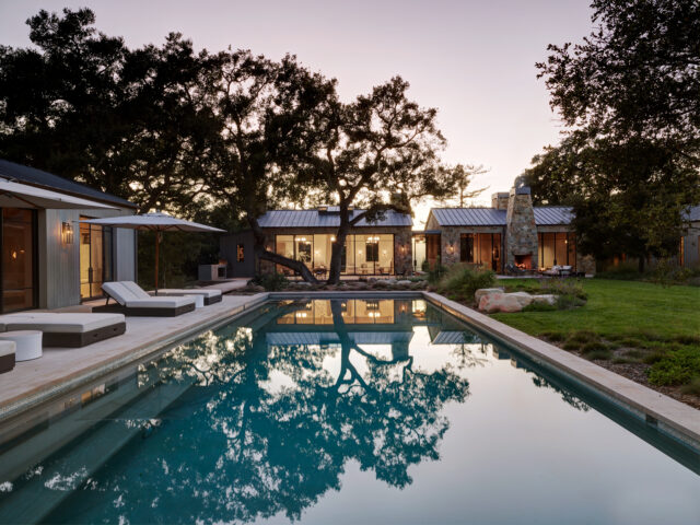
The house at dusk. Year-round, it’s lovely to be outside here as the light changes. The outdoor fireplace off the billiard room is a favorite spot for s’mores. Photography by LAURA HULL.
Kazuko and I first started coming to Montecito on our way up and down the coast from Big Sur. At one point we were seriously thinking about building a place up north, but Kazuko was pregnant with our son Koji at the time. So, we began wondering about this countryside closer to Los Angeles as an option, and we looked for a long time.
The property we fell in love with was not large, at just over an acre. But it had striking views of the surrounding mountains and a number of amazing California live oak trees, most over 200 years old. A small house and stable from the 1940s weren’t salvageable, but they gave the land more history.
The home we envisioned was similar to a compound, consisting of a group of easy, neighboring structures. We wanted to feel like we were on vacation, with outbuildings for activities and guests, and ample space to be outside. Modern, but also natural and local.
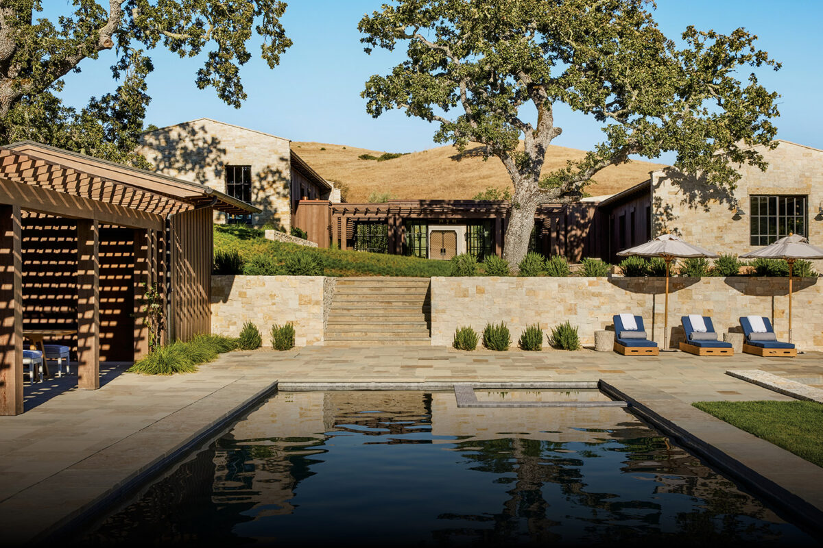
We arranged these buildings in a loose quadrangle around a central pool and lawn, all pushed out to the edges of the property so that we’d have the greatest amount of outdoor living space in the middle. Some of the structures are made of wood, others of golden Santa Barbara sandstone; we discovered our own abundant supply of the stone while digging the foundations on the property. A large wood deck connects the main house to the outdoors. Facing the deck, huge sliding glass doors erase the line between what’s inside and what’s outside.
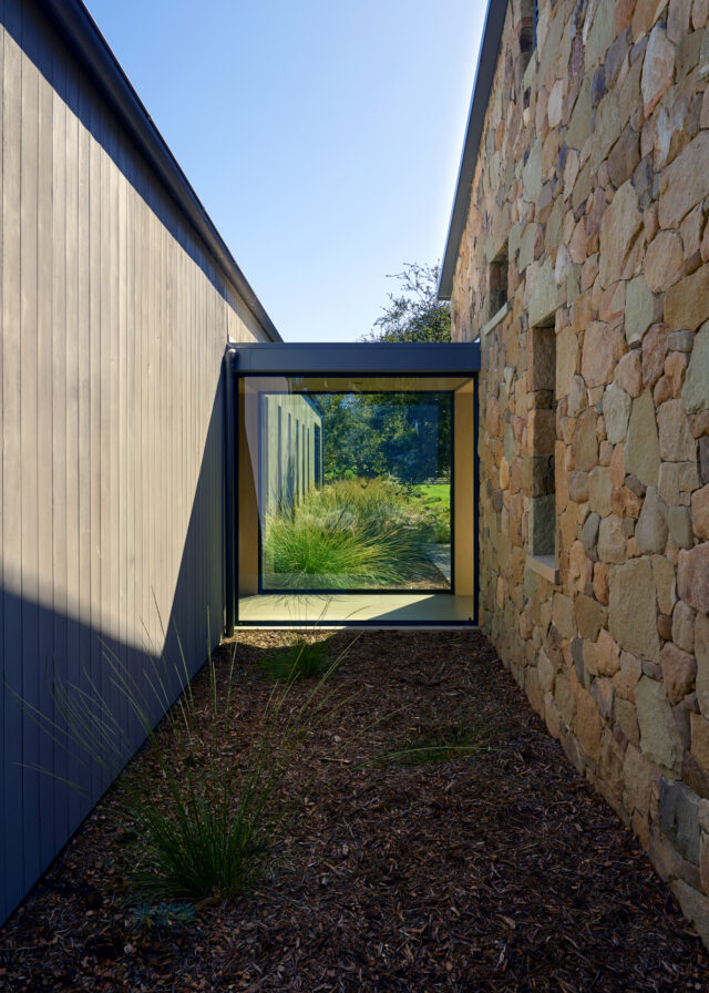
A glass passageway floats between the stone buildings and the wood-clad bedroom wing, becoming both a transparency and a sculpture outside of the house. Photography by LAURA HULL.
The wings of the main house are joined in an L-shape by glazed breezeways. Two flanking stone buildings include a great room with the kitchen, and then a billiard room. Turned 90 degrees, the bedroom wing is clad in wood. The materials and the low, quiet profile of the buildings let the architecture merge organically into the wild, surrounding landscape.
The great room is where we spend most of our time. We wanted the experience of being all together in one space, especially in terms of having the kitchen there. The room has the rustic echo of a lodge, with its wood beam cathedral ceilings, cedar doors, and a tall, stone fireplace. All the interiors fall into this same material range of stained cedarwood with honed marble, brushed limestone, and burnished brass. Colors are intentionally muted and natural. We used midcentury light fixtures and vintage modern furnishings throughout to make it all feel classic.
The priority of outdoor living at this house means we do enjoy the gardens and the pool every day, whenever we are here. For design balance, the pool house mirrors the bedroom wing in its wood plank construction in and out. We created this little house to have a dedicated indoor-outdoor space near the pool, but we use it just as much for guests. With kids now frequently visiting, we made a pair of bedrooms here — one with a trim, built-in bunk and trundle bed. It may be the smallest bedroom we’ve ever done, almost nautical in style for this compact space, but everything fits and tucks away perfectly.
Avignon
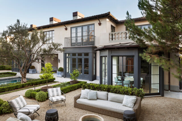
Balconies, bays, and balustrades contribute to the clean yet classical architecture of the house. In particular, the pair of squared bay windows extends the traditional paneled style of the interior. Photography by LAURA HULL.
This residence in the Los Angeles neighborhood of Brentwood is designed in the manner of a French provincial chateau. The client had seen our own home in Hancock Park and liked our interpretation of classical French style for modern California life. Their wish was to create a close relative of our house, with a slightly dressier, yet still peaceful expression, in both the architecture and interiors.
In composing the house, we developed pared-down variations of archetypal forms from old-world, country chateaux. A central hallway creates a long, uninterrupted view from the front entrance out to the backyard and the pool. Moving inward, receiving rooms open on either side — a library on the right and a dining room on the left. A lyrical oval staircase is located in front of a two-story steel window with a skylight above, bringing light into the core of the house. A sun-filled kitchen and breakfast room form a modern-scaled side wing, with a view onto another outdoor sitting area set amid a courtyard, and across from it, a guesthouse.
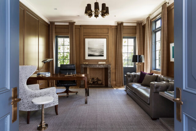
The study is traditionally and fully paneled in custom-stained oak for a warm, old-world elegance. The eighteenth-century fireplace mantel is French Regency. We collected many of the mantels for the house from the region around Versailles. Photography by LAURA HULL.
The character of the house is revealed in its delicate paneling language. Rooms are delineated with the type of finely crafted millwork and material detailing to be found in antique French homes. Walls are panelized and ceilings have decorative mouldings, coves, and beams that break up the scale of big spaces. Cabinetry is built with more graceful paneling, French moulding profiles, and elegant hardware, from the kitchen to the commode-style vanities in the bathrooms. Fireplaces add age with antique marble mantels that we collected for the house in France, particularly from the region around Versailles, and in a range of styles from the eighteenth and nineteenth centuries.
In this same lineage, we used pale grey, cerused, wide oak planks for the flooring, and soft bisque and blue-grey paint finishes to match rich charcoal-colored, paneled doors — our update of a classic French palette. Continuing to streamline, Kazuko designed much of the furniture in sympathy with later French modern style. Pieces have a chic but very finished air, handcrafted in lavish materials.
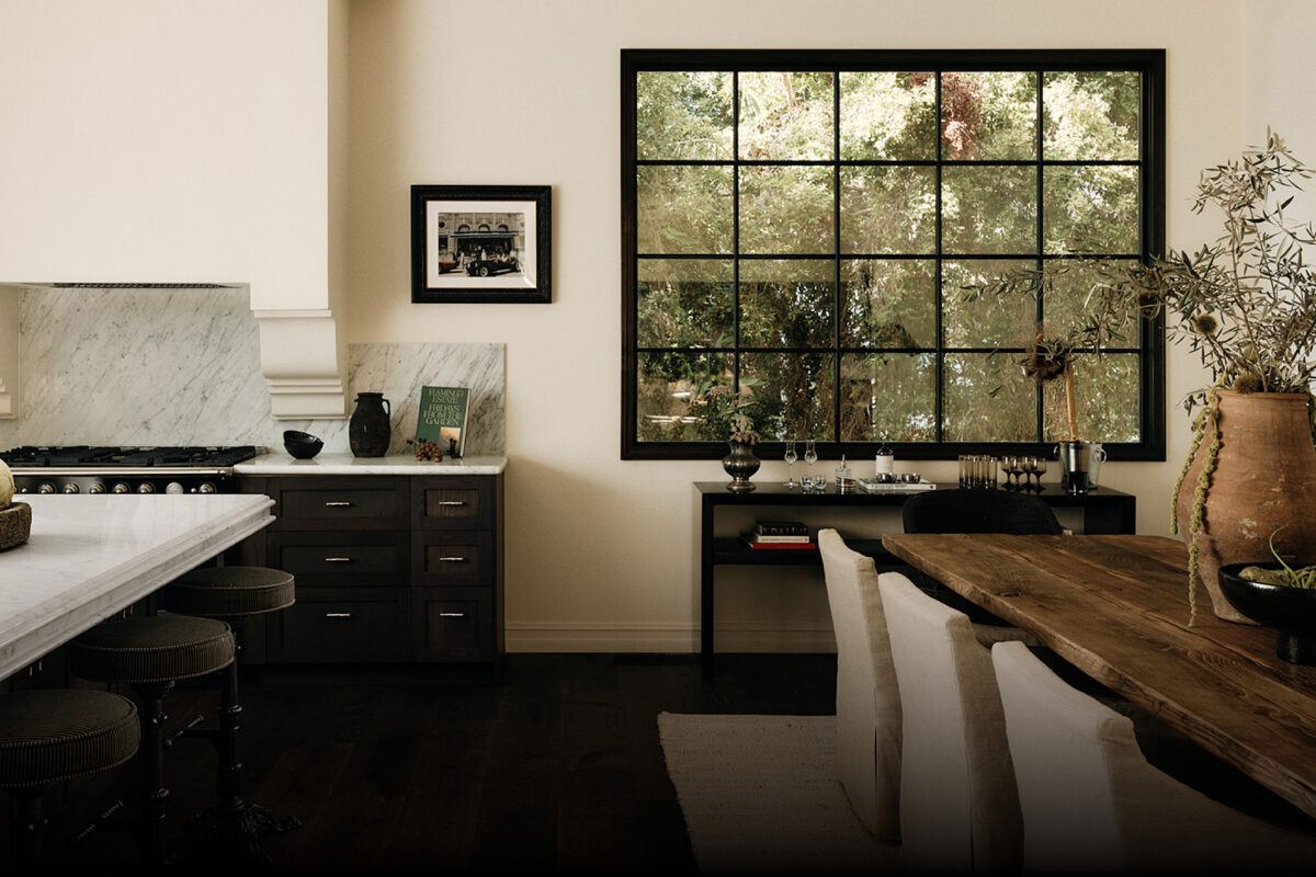
The large, friendly kitchen needed to be a loved and practical space for a family that gathers here to cook and entertain — not just a kitchen for show. Still, I wanted to make the kitchen feel occupied by furniture, not equipment. Both the island and a long wall of cabinetry satisfy this concept, fulfilling practical storage requirements without making the room bulky. And typically of today, the island, with its wide, marble countertop and seating, is the center of family life. It joins the family room and breakfast bay to form an extended, relaxed hosting area that flows out to the terrace and pool. That balance of antique heritage and modern living was the aim throughout this house. And we continue to explore this mix of French and California ideas for many of our clients.
Flight
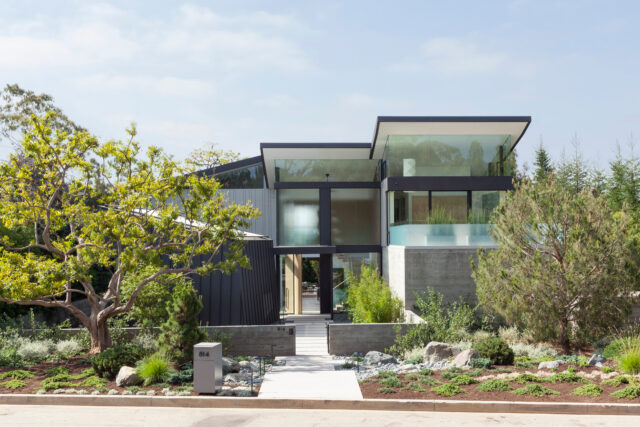
The various sloped planes of the roof are visible from the front of the house. Board-form concrete and steel paneling, along with glass, are the major building materials. This palette was chosen not only for aesthetics, but also for weather resistance and low maintenance. The owners wanted materials that would require little upkeep for the times when they plan to be traveling. Photography by ROGER DAVIES.
The heart of this new modern house in Pacific Palisades was to serve a creative couple as they transitioned into working less and traveling more. They had raised their kids in a 1920s Spanish colonial house in Santa Monica; for this new residence, they didn’t need a big family household and didn’t want to walk past empty bedrooms.
The husband is a gourmet food purveyor and a serious wine collector, and the wife is a gourmet cook; so, a significant kitchen and a wine room had to be primary. The wife is also an artist and she needed a studio, but preferably apart from the house, so it could be a retreat for her.
In an extra twist, local zoning laws required houses in this neighborhood to have mostly pitched roofs to maintain continuity with the surrounding traditional architecture. So, we had to come up with a scheme that had sloping rooflines, without using classic gables. Floating planes of metal roofing came about to provide the imposed gradients. Simulating wings in flight as they ascend above glass-encased rooms, they turned out to be one of the best things about the house.
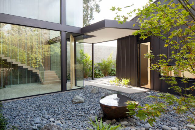
An interior courtyard extends around the entry to the main house, with the same Japanese garden elements throughout. Various boulders are part of the tranquil setting; a Japanese maple tree provides color. The art studio left of the entry has an irregular shape that is meant to evoke a large boulder. The structure is clad in low-maintenance, black aluminum panels, emphasizing the form. A tall doorway opens to the courtyard for private passage to and from the house. Photography by ROGER DAVIES.
Early on we also needed to solve for where to site the painting studio in relation to the main house. Originally, it seemed logical to place a studio in the backyard. But on this fairly compact and tapered lot, putting another building there interfered with the harmony of the pool and the terrace as extensions of the living space. Then I realized that the studio could be designed as a kind of sculpture, an irregular shape in the house’s big entry courtyard — like a boulder in the Ryoan-ji rock garden in Kyoto. That decision led to the idea of interpreting this outdoor space as an ode to Japan, and the sheltered front court quickly became a meditative gravel rock garden.
Inside, the couple wanted to simplify down to casual, one-room living. Much like a loft, the main floor is occupied by a wide, multi-purpose great room and kitchen. The full space opens onto a shaded terrace and the pool. This large main room in turn sets up the spacious master suite on top of it that rises to reveal the sky with a perimeter of clerestory windows. Peripheral rooms off this core include guest suites for the couple’s children or visitors, a gym, an office, and, below, a full wine cellar and a comfortable screening room. This is all done with a minimum of internal hallways.
As part of the flow for both entertaining and home life, the large kitchen was designed for the wife and for professional-grade cooking. We partitioned the space with a glassed-in wine room that acts as a visual art piece as well as a dividing wall. Here as in the rest of the house, the finishes are practical, modern, and very durable. And, everything is tailored to exactly how the wife likes to cook. Even the island countertop was made a few inches below normal height, all bespoke and measured out for her. Excerpted from California Homes II (Images Publishing, $75).
Feature image: The back of the house is all glass, so that there’s no visual separation between inside and outside. Photography by ROGER DAVIES (Flight).
January 17, 2024.
Discover more DESIGN news.

