Inspired by Scandinavian-modernism and California landscapes, the creative mixed natural elements and iconic statements for fresh, unfussy results
Words by MARTHA McCULLY
Photography by YOSHIHIRO MAKINO
When Pamela Shamshiri first encounters a house, she delves into its existence, discovering its past lives and present condition, and helps shape its future. “I’m honoring the journey the house has been on and prepping it for its next chapter,” she says. She adopted this approach as a founding member of Commune and now employs it with her brother Ramin at Studio Shamshiri, designing such projects as the recently opened Atelier Ace Maison de la Luz hotel in New Orleans; Anne Hathaway’s Southern California Swiss chalet-style home; and a ranch house nestled in the Hollywood Hills for Seth and Lauren Rogen. Her deep knowledge of design history and infinite appreciation for light and color inform her choices, often resulting in an eclectic and collected look rooted in time and nature.
“I’m honoring the journey the house has been on”
Pamela Shamshiri
Then she falls in love. In this particular case, her clients saw Shamshiri’s own Laurel Canyon home in a book and were enthralled with how she had brought the soul of her 1947 Rudolph Schindler house to life again. For their abode, a 1957 modern residence in San Diego near La Jolla, they wanted the same concept, a place that honors its history but is ready for contemporary living. The project intrigued her, and she felt deeply connected to the clients. So Studio Shamshiri unearthed the structure’s bones and combined her clients’ Denmark and Malibu heritages to create a Danish-inspired modern home for California ranch-style living.
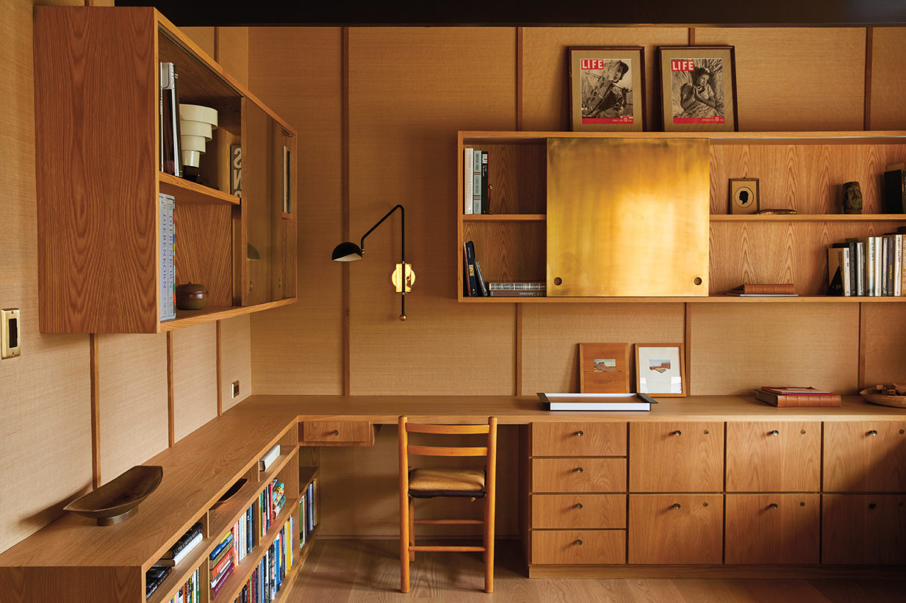
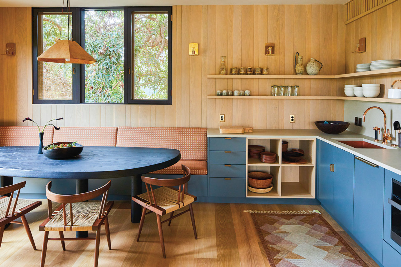
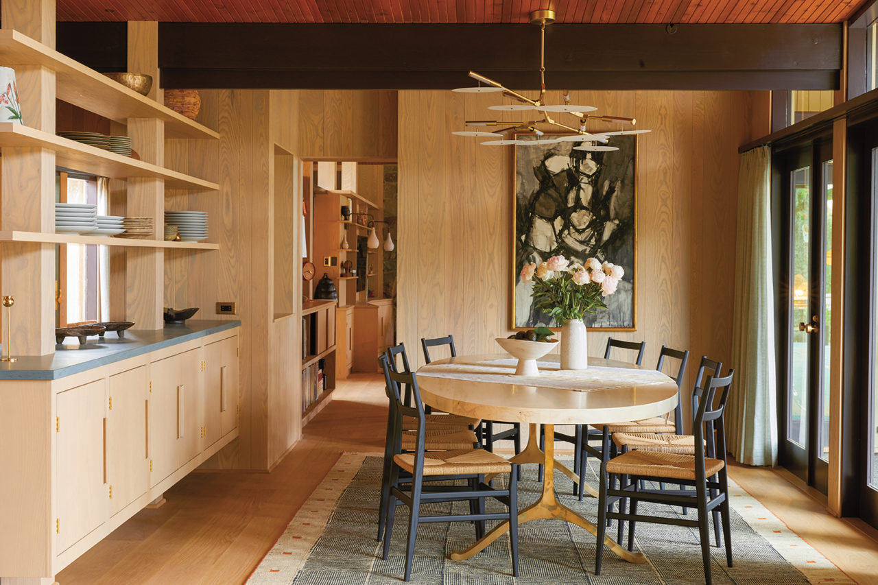
With an intense appreciation for the house’s architect, John August Reed, who studied with Frank Lloyd Wright, Schindler and Irving Gill — one of Shamshiri’s personal heroes — the project became a partial restoration, partial renovation with an expanded footprint and a pool house built from the ground up. Starting with the millwork, “we got the house back to its original state for the most part,” she says, noting the exceptions of the kitchen, bathrooms and windows. (Once you’ve removed the windows, you’re pretty much down to the studs, she points out.) The family room became the focus of the house, with four separate rooms combined to create an open family area, kitchen, dining and living room. Transparent shelving was added to form a hallway.
There are many different types of wood in the house; to the original Japanese cedar she added white oak and Douglas fir. “We really focused on the washes, making it look like it all went together. We do a watered-down color and a lot of oils with low VOCs. I’m super conscious of air quality,” she says.
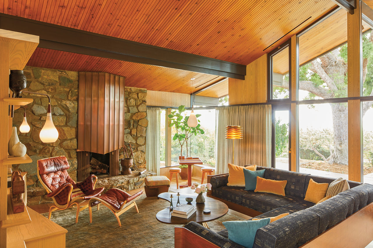
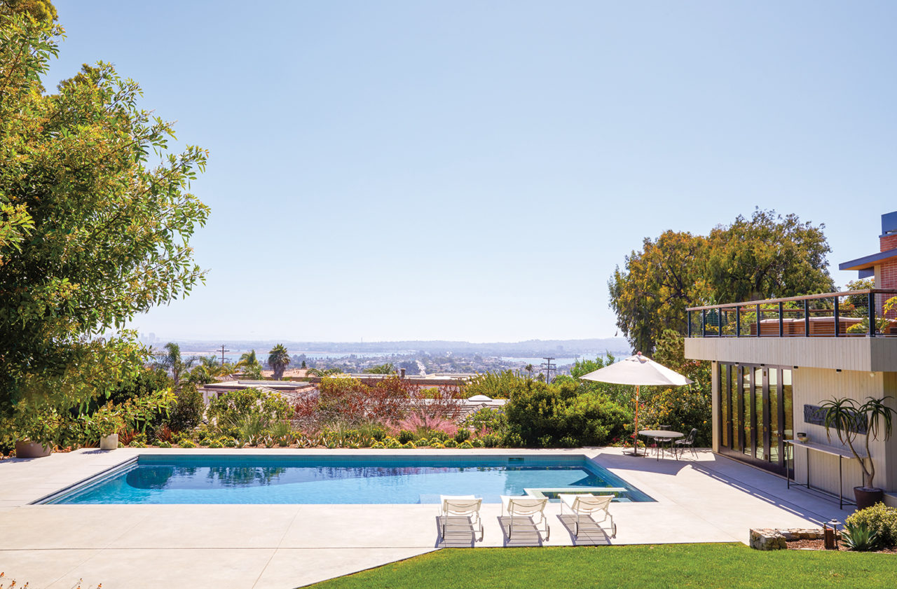
The linear layout has its roots in California ranch design, where almost every room in the house is in a straight line, and — other than the bedrooms — opens up to the back and front yards so there’s light coming in on both sides. The rear of the house looks first onto a pool, then the bay and then the ocean beyond it. Original floor-to-ceiling windows and French doors invite the view to be part of the interior. For every indoor room, there’s a correlating outdoor living space. “There’s a lot of going from inside to outside,” Shamshiri says.
Shamshiri’s embrace of nature is also a reflection of architect Reed’s teachers and historical origins. Both Lloyd Wright and Schindler had made pilgrimages to Kyoto and brought back the idea of wide-open interior spaces, open plans and framed views as part of the modernist movement. Shamshiri created that feeling here by adding trees close to the house to frame the coastline view.
“I embrace wabi sabi and aging, it’s more honest”
Pamela Shamshiri
The interior palette is nature-inspired as well. Vermont green slate in the kitchen is meant to be worn in, as are the raw copper fixtures. “I embrace wabi sabi and aging, it’s more honest,” Shamshiri says. “I like things to be permeable. We chose materials that get better with time. We’re really conscious of what we use, like hard woods and real stone instead of plastic — things that age well.” Throughout the house, colors like tans and greens and the washed-out black of the custom living room couch reflect the outdoors. Wooden doors are teal with doorframes washed in pale green. Where there isn’t wood paneling or cabinetry, walls feature a very pale green paint instead of a traditional white.
The outdoor spaces themselves — complete with shower, sauna and steam baths — reflect Scandinavian living, with its emphasis on greenery, wood and spa. So do the furnishings, including many vintage pieces from Copenhagen, and the clients’ own collection of Eames classics. Throughout, artworks created by family members were reframed and hung. A vintage leather Bruno Mathsson Pernilla chair with an ottoman resides in the living room, along with a vintage pair of Hans J. Wegner chairs in oak and shearling. Then there’s the piano, a reissue of a 1931 original by Danish architect and lighting designer Poul Henningsen, a housewarming gift from another branch of the clients’ family.
Shamshiri credits the enveloping light in the house to the original architect. “The light travels like a rainbow from one side to the other, it’s so crazy.” She installed sheers on the windows with a pale blue-gray tint to filter it. “There’s so much glass, it seems counterintuitive to bring in that much fabric,” she says. The result is light that is present but diffused, an effect Shamshiri sums up like this: “If a room is just perfect, it sings.”
The pool house, which is completely new, was inspired by the California coastline too, with Sausalito and Mill Valley serving as models for how two-story vertical buildings blend into the landscapes. Here, Scandinavian furniture, including a 1960s Arne Norell Kontiki sofa from Sweden and a 1950s Hans Brattrud sculptural Scandia reclining chair from Norway, make this not your ordinary towel stash.
Shamshiri wanted this project to be “a very warm and cozy house on the coast, with an eye toward Europe and a romanticized notion of an expat living in California,” she says, adding she loves the collaborative process with her clients — insisting their home look like a summation of their travels, where they’re from and where they are right now, describing it as fancy without pretension. “I want it to feel like it came from their history and heritage,” she says. “And if we do our job right, we’re supporting the way people want to live.”
Feature image: Originally designed and built in 1957 by architect JOHN AUGUST REED, the San Diego home was recently updated by STUDIO SHAMSHIRI. The clients have a view of the ocean framed by the landscape, including the podocarpus tree.
This story originally appeared in the November 2019 issue of C Magazine.
Discover more DESIGN news.

