The interior designer behind the abodes of Diane Keaton, Jennifer Aniston and Ryan Murphy reveals his secrets
Words by STEPHEN SHADLEY with PATRICK PACHECO
My career as an interior designer has been both accidental and inevitable.
Accidental because while I had plenty of ambition I had little confidence. That is, until I met a well-known designer, Bob Bray, who provided key encouragement in the early days. As well — and fortuitously — by that time I knew an extraordinarily gifted woman, Diane Keaton, who would generously share her talents in collaborations that continue to this day.
Inevitable because I had a mother, Dorothy Shadley, who convinced me I could do anything I set my mind to. And also that, from an early age, I had a passion for movies which opened within me a world of wonder and imagination.
Looking back, I can trace the beginning of my love affair with Hollywood and homes to the Sunday afternoon when, at my insistence, my family piled into our 1953 matte blue Pontiac Chieftain to search for Walt Disney’s house in Holmby Hills. We had recently moved to Los Angeles from St. Louis, Missouri, and it was only the year before that Dorothy had taken my brother John and me to see Walt Disney’s Sleeping Beauty.

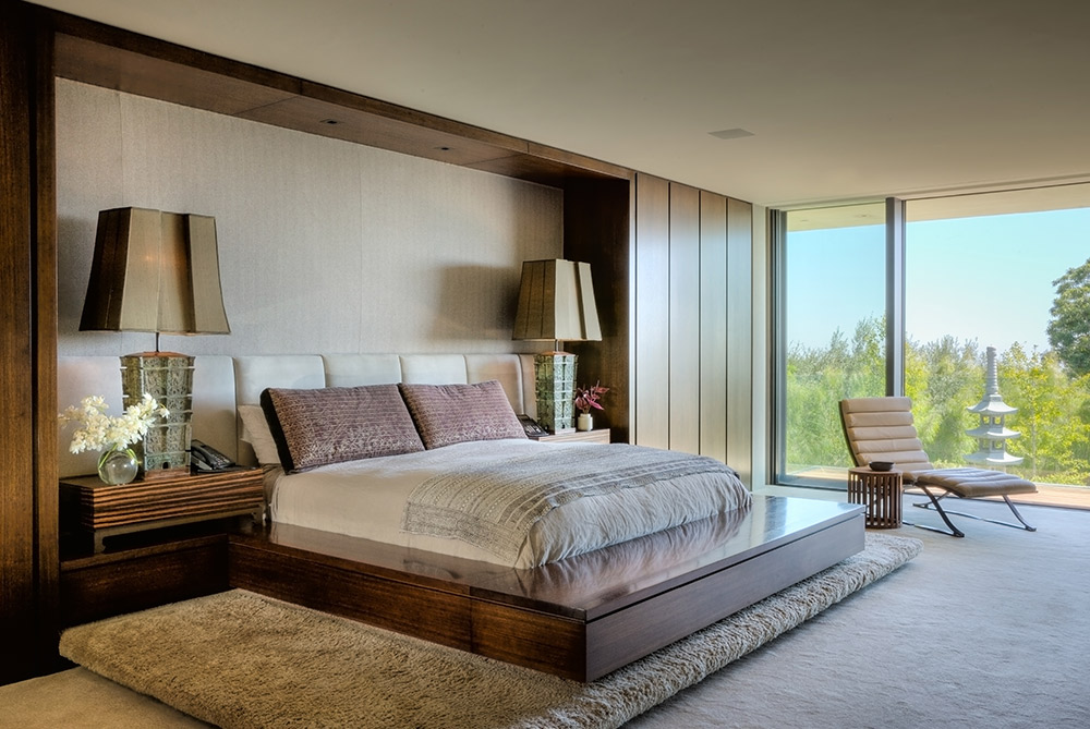
“I’m all about cozy and comfort,” JENNIFER ANISTON told STEPHEN SHADLEY, who designed the interiors of her former home in Bel Air. Photo by David Glomb.
To describe it as a profoundly seismic event in my life would be an understatement. I begged my mother to endure the long bus ride downtown to see it six more times, and, even now, many decades later, I look with happiness at a newspaper ad for the film that I carefully cut out and preserved for posterity.
As we drove along Wilshire Boulevard from our modest home in Inglewood toward Holmby Hills, I’m not sure what I expected to find. Perhaps a glimpse of the Great Man himself watering his lawn? But, like millions of others who buy those maps of stars’ homes hawked on corners, movies represented a romance in life that we just weren’t living at the time and they sparked a desire to go to a place where it was real and attainable. Just to breathe the air and to be in the proximity of it was enough.
Those same fantasies were nurtured as well by my high school art teacher, Clay Beale, who was a first cousin to Montgomery Clift and who regaled us with tales of his visits to Pickfair, the legendary home of Douglas Fairbanks and Mary Pickford, designed by Wallace Neff.
Years later, my fascination would continue when my friend Tim Hawkins and I sought out the homes of Greta Garbo and Katharine Hepburn in New York. I suppose, even on a subconscious level, I must have believed that men and women who lived their lives in front of the camera had to bring that glamor into their homes as well.
I got my foot in the door, so to speak, into the glorious world of film when I landed a job as a scenic artist at 20th Century Fox. As I helped paint the New York cityscape for On A Clear Day You Can See Forever, I became fascinated with film production design — the painterly approach to color, texture and composition.
I realized then how cinema affects the way we see the world around us and, sometimes, how we actually want to live in it. Films come and go each year and yet the stories they tell and the places they portray continue to live in our minds and spark our imaginations. They are the popular reflection of our common experience and visual lexicon.
I must have believed that men and women who lived their lives in front of the camera had to bring that glamor into their homes as well
I came face to face with someone who could touch the public in just that way when — following 20th Century Fox and a stint with Disney on Parade — I moved to New York to pursue a career as an artist. One summer day, I opened the door of my Chinatown loft to greet Mike Balog, a friend and fellow artist, who’d brought along a guest: a young woman with the charm, humor, curiosity and total self-effacement which would make America fall in love with her a year later.
Diane Keaton had yet to become Annie Hall but, as we got to know each other, I admired in her what I would later discover about the many film artists — Jennifer Aniston, Ryan Murphy, Matthew Modine, Woody Allen, and Robert Altman — with all of whom I’d later collaborate on homes. Like many of her peers, she was a huge romantic and fearless when it came to putting herself “out there.”
Diane met life on her own terms. She would take on enormous projects and bring everything she had to the table, pushing the limits with tremendous passion. I could match her on passion. I couldn’t — and still can’t — match her energy.
After we met, our friendship grew. We took in the occasional movie or art show. I watched as she became more and more famous through her remarkable achievements and she saw me through an evolution from aspiring artist to designer. That began when a friend, the actor Michael Murphy, asked me to design sets for an Off-Broadway show, Rats Nest, which he was directing. I accepted.
Shortly after, the same people involved in the play decided to renovate a restaurant from a casual Eastside neighborhood hangout, Dr. Generosity, to a more elegant establishment to be dubbed Camelback and Central.
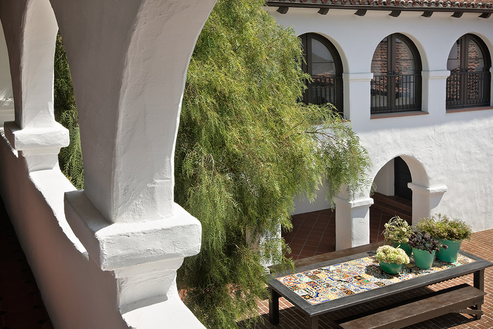
Looking into the courtyard of DIANE KEATON’s former Spanish Colonial home in Beverly Hills. Photo by Scott Frances.
I was not the first choice to design the restaurant. Bob Bray, then a celebrated designer, was. But he generously passed the baton to me. Whatever insecurity I had about my first major design job was erased with his confident assertion: “You can do this. Besides, I’ll have your back every step of the way.” How Bob had more confidence in me than I had in myself is just one of those little miracles in life to which the only response is gratitude.
The restaurant was a big success and drew a glittering clientele, Diane Keaton among them. So I was more confident when some years later Diane asked me and my design partner at the time, Richard Gillette, to take a ride up the Hudson River from Manhattan to Snedens Landing to renovate a house.
A year later, it would be featured in House & Garden and formally launch a career that had been steeping for years through a mania for all things Disney, to the workshops of 20th Century Fox, to a colorful stint with Disney on Parade, and, along the way, lucky and fruitful encounters with talented and generous people.
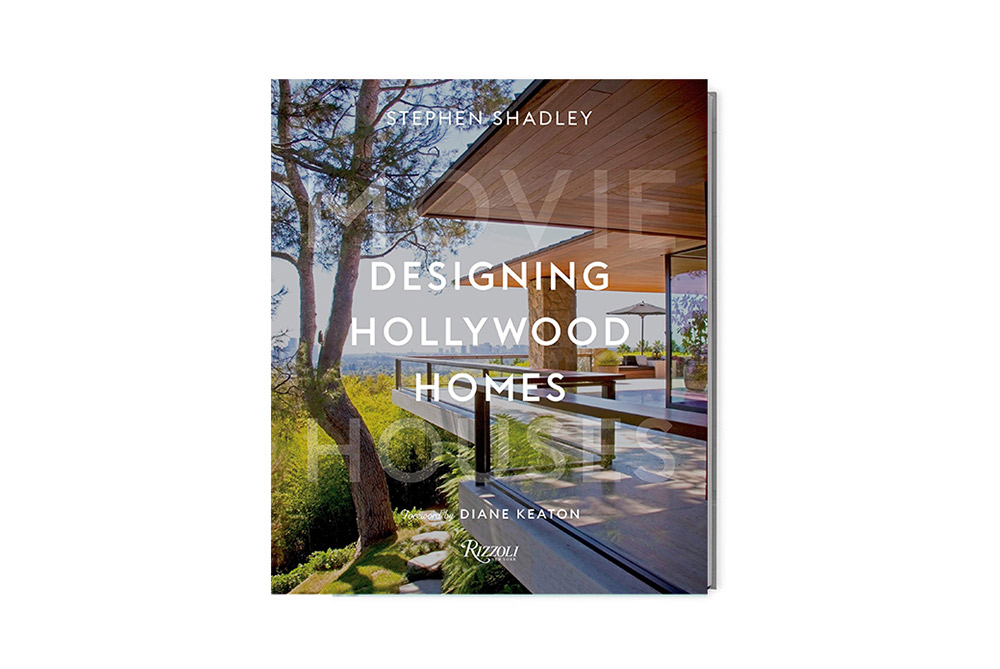
Since that ride up to Snedens, I’ve had many different clients in assorted and distinct spheres of the business world. But, needless to say, there is something special about show people. My book Designing Hollywood Homes: Movie Houses ($65, Rizzoli New York) has tried to capture that special magic in all of its splendid and unexpected ways.
This is, after all, about a tribe of people who spend their lives at a dream factory in front of — or behind — a camera and who bring that world into their lives at home. As a consequence they can, more easily than most, conjure a fantasy world of design and imagination. You can just picture the opportunities that open up!
What holds true for all of these chapters is how each of these homes reflect their owner’s love of story. They breathe it. They live it.
Our collaborations in sketching those narratives are drawn from the sum total of our respective experiences. So what follows is my story, their story and the story of our partnerships, informed by the history of film and architecture and animated by passion, wit, joy, maverick taste and theatricality. Collaborations as accidental and inevitable as my career has had the good fortune to be.
• • • • •

DIANE KEATON and STEPHEN SHADLEY remade several interior elements to suit the home’s Spanish heritage, such as brick floors and arched doorways. Photo by Scott Frances.
THE SECOND TIME AROUND
Diane Keaton’s home, Beverly Hills, California
The public knows Diane Keaton for her movies as well as for her unique personal style, which, immortalized in Annie Hall, started a fashion trend. At home, she is no less stylish but usually barefoot, even when that home is a construction site and the result has been many broken toes. That free-spirited approach was the key for our renovation of a simple house on North Roxbury Drive in Beverly Hills, the fifth in our series of collaborations.
The Spanish Colonial style house had been designed by Ralph Flewelling in the 1920s and Diane’s purchase of it in 2006 was the second time around. We’d seen it years before and she’d even made an offer. But another house caught her attention and she backed out of the deal. When it came back on the market three years later, she had no second thoughts. She was especially taken with the enclosed and nicely proportioned courtyard. It gave the feeling of being in the contemplative quiet of an early California mission — even though the house was just one block from Sunset Boulevard.
A speculator had bought the house and done extensive renovations. Some good: an enlarged kitchen out of which a family room could be carved so that her two kids, Duke and Dexter, could romp. Some bad: several disparately designed fireplaces (one with a faux coat-of-arms insignia) and an entrance that had been bumped up from one story to two, a boxy room as ungainly as it was unwelcoming.
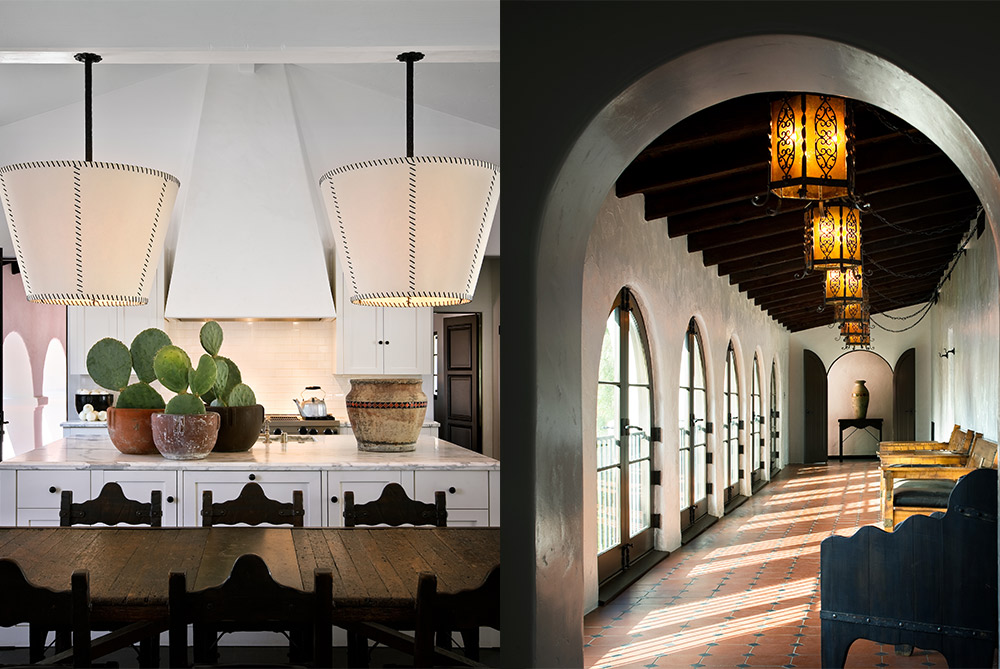
Left: The kitchen, with its high ceiling. Right: An enclosed walkway with wrought-iron light fixtures and simple furnishings. Photos by Scott Frances.
Diane loves big spaces. No ceiling can be too high and no space too large. After all, she fantasized about what it would be like to live in a Los Angeles water and power building. But it didn’t take her long to size up the cavernous entrance and suggest a clever remedy. “Steve, why don’t we make this into a library?” I loved the idea. For one, it was unorthodox. What house has a library for an entrance? For another, she had a vast amount of books, many over-sized volumes devoted to architecture, art and photography, her big passions — though, surprisingly, not as many about the movies.
To make the entrance warmer and more engaging, we vaulted the high flat ceiling, put a clerestory window above the front door for added light, and lined the walls with deep bookshelves that made the room feel cozier. We installed a rolling stepladder and, as the house neared completion, I would often find her on top of it, arranging and re-arranging the books, alphabetically and by topic. She ringed the walls around the bookshelves with the maxim, “THE EYE SEES WHAT THE MIND KNOWS,” painted in capital letters.
The spaces recalled for Diane Keaton “the ache of romance” of the missions and historic California hotels
What Diane knew about the house was that all five of the fireplaces had to be remade to suit the house’s Spanish heritage. What eventually worked was a sketch I made of an arched brick opening surrounded by white stucco plaster and topped by a graphic squared-off mantle. But then the search was on, along with Diane’s quest to find just the right brick.
Weeks later, a brown oversized one ended the hunt and we modified the same design on all the fireplaces throughout the house, including the bedroom and kitchen. The same brick served as the building block for a big apron off the front door and planters around the house. When Diane finds something she loves, she likes to use it over and over again. The vocabulary may be limited but the choices are not.
The reassurance that comes from repeated elements came into play in the loggias surrounding the courtyard, a symphony of dark beams, white stucco walls, arched doorways, brick floors and black iron grilles framing the windows. Simply furnished with Monterey benches and chairs, the spaces recalled for Diane “the ache of romance” of the missions and historic California hotels she visited with her family when she was a child. The courtyard itself, with its gurgling fountain and entrances and exits to the rooms, gave the house a theatrical flair. It also made its owner feel safe and protected. “You’re walled in by the shape of the house,” she told a writer. “Everything looks inward which is actually very soothing. It’s like you’re creating your own home. Your own world.”
In all of our collaborations, Diane was intent on creating her own worlds; some might even call them sets. A lifetime of mapping out her longings on bulletin boards pinned with images torn from shelter magazines, architectural blogs and websites was always geared toward creating what she called “the perfect California home.” One that was never far away from the collective impulses and dreams of the artists who originally built the houses she bought and resold.
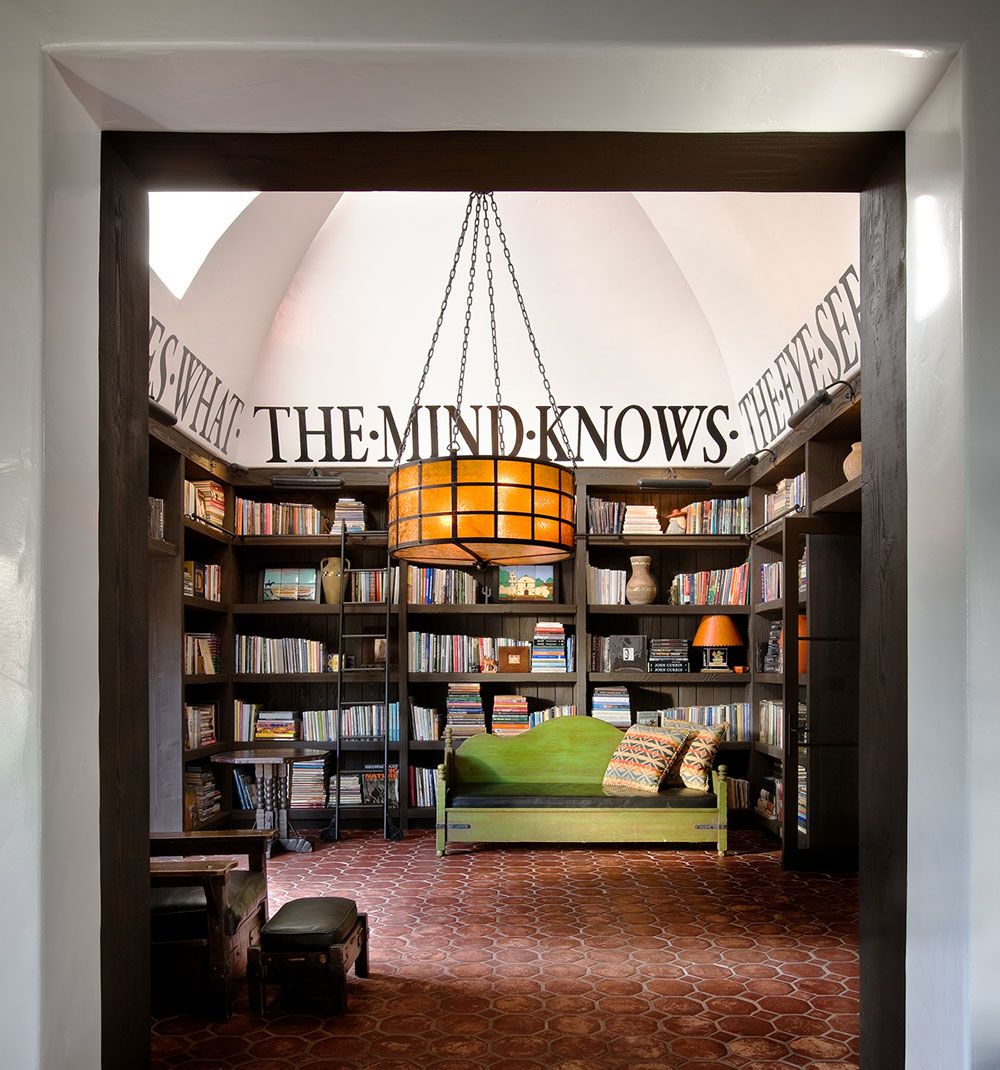
It was DIANE KEATON’s idea to make the home’s cavernous entrance a library. Photo by Scott Frances.
Diane could perfectly articulate to me the ideas that she had in her head. Translating them into concrete, wood, and glass was another matter. Perfection can never be reached. But she came as close to it as humanly possible. In an introduction to her book California Romantica she expressed her manifesto: “The secret wish for the ambiguity of drama, the dark side of romance, the bittersweet lie of perfection.”
What stands as a testament to her relentless drive is the fact that the people who later purchased the houses we worked on changed very little about them, if anything. They might have been created, to a certain extent, as showcases of ideas. But they were always functional and organic. In other words, livable. Like the Old Masters who sketched the skeletons of their subjects before draping them in brightly colored robes, Diane was as meticulous about the less visited areas of the house as those on display. In the recesses of her bedroom closet at the Roxbury house was a museum-worthy installation of her hats, dozens upon dozens of brimmed hats, top hats, caps and berets.
We finished off the renovations by covering the driveway and courtyard in DG — decomposed granite, a favorite material of hers because it was often used at the California missions. The rough golden beauty comes with a disadvantage. Everyone was telling us, “Don’t use it. It’s dusty and dirty. It can make a mess, especially if women are wearing high heels.” Diane wasn’t concerned. “Don’t worry, that’s so not me,” she replied.
• • • • •
Organic materials like wood, stone and bronze added a tactile warmth to JENNIFER ANISTON’s former home in Bel Air. Photo by David Glomb.
THE TONIGHT SHOW
Jennifer Aniston’s home, Bel Air, California
The first time I saw the massive 14-foot red lacquered doors that were the entrance to Jen’s house in Bel Air, I immediately knew that their days were numbered. But what to do? Inspiration can come from many quarters and, in this case, it came from a most unlikely source: The Tonight Show Starring Johnny Carson.
One night at my loft in Manhattan, I was watching an homage to the legendary entertainer and among the featured clips was footage of the show’s premiere. There, in black and white, was a screen behind Carson’s desk and the nearby sofa perforated in a beautiful motif. Recalling the set from nights spent watching the show in my youth, I grabbed the TV remote and rewound the footage back and forth, letting a solution to Jen’s front door seep in.
“What a perfect pattern to sandblast in bronze,” I thought. I grabbed my phone and took screen shots. I sent them to Jen whose enthusiastic reaction matched mine. With her own history of talk show appearances, she loved the provenance as well as the design itself.
On this second collaboration with Jen after the process of designing her previous home in Beverly Hills, I found someone now more confident in her choices and sense of style. She knew how she wanted to live: casually elegant with a muted color palette, straightforward and simple textiles and fabrics, classic furnishings in graphic shapes, and rooms with a connection to the open air of Southern California.
“I’m all about cozy and comfort, “ Jen said. Sexy and fun were also part of her design lexicon.
Great care was taken in selecting fabrics, whether vintage Indonesian textiles or plain Belgian linens. Photo by David Glomb.
This structured informality was to be layered on a midcentury house designed by A. Quincy Jones and which had been modified later by the architect Frederick Fisher. The stark modernist ambiance was a little too cool and minimal for Jen’s taste. So the first order of business was to introduce organic materials of texture, substance and depth — wood, stone, bronze — which would add a tactile, welcoming warmth to the place. As Jen put it, she wanted her home to reflect “old world meeting new world.”
As Jennifer Aniston put it, she wanted her home to reflect “old world meeting new world”
Getting the flow right started with the living room, which was a large and unstructured space. Knowing Jen’s penchant for entertaining, I came up with the idea of an imposing bar as the theatrical anchor of the room. My design featured large walnut panels set apart in a spacious alcove carved from what had been an adjacent storage space. I loved the idea that you could walk into and around this intimate space and fix yourself a drink (an informal touch which was always a hit with guests). The off-white suede and bronze bar stools provided a perch on which to hang out.
At the other end of the room, I created a symmetrical surround of blackened bronze for the wood-burning fireplace. You could slip into both the bar and fireplace areas but you could still feel a part of the social activity at large.
Jen embraced sensual décor throughout the house — shag rugs, silk carpets, suede headboards, leather chairs. But a sexy ambience is mostly determined by the people who inhabit a room and her guest list more than filled that bill. The trick was to create contexts that were conducive to intimate conversation. I did this in the living room through the placement of three sofas, creating a number of corners to which guests could retreat for a chat.
For the kitchen, which featured one of Jen’s favorite elements, the pizza oven, I designed an island counter, always a popular place to congregate and where Jen, no stranger to multi-tasking, could toggle between visiting with friends and working at a nearby desk.
The Asian calm, which was so much a part of our first collaboration, suffused the new house as well, but with more eclectic flourishes that demanded a harmonious layering. Jen’s office was a case in point with its modernist Don S. Shoemaker “power” desk, 1930s French leather lounge chairs, Tiffany lamp, and a large tapestry evoking the classical Far East. I took care in selecting fabrics to show Jen because she had a keen, almost mystical connection to them, whether vintage Indonesian textiles or plain Belgian linens. “They feed my soul,” she said.
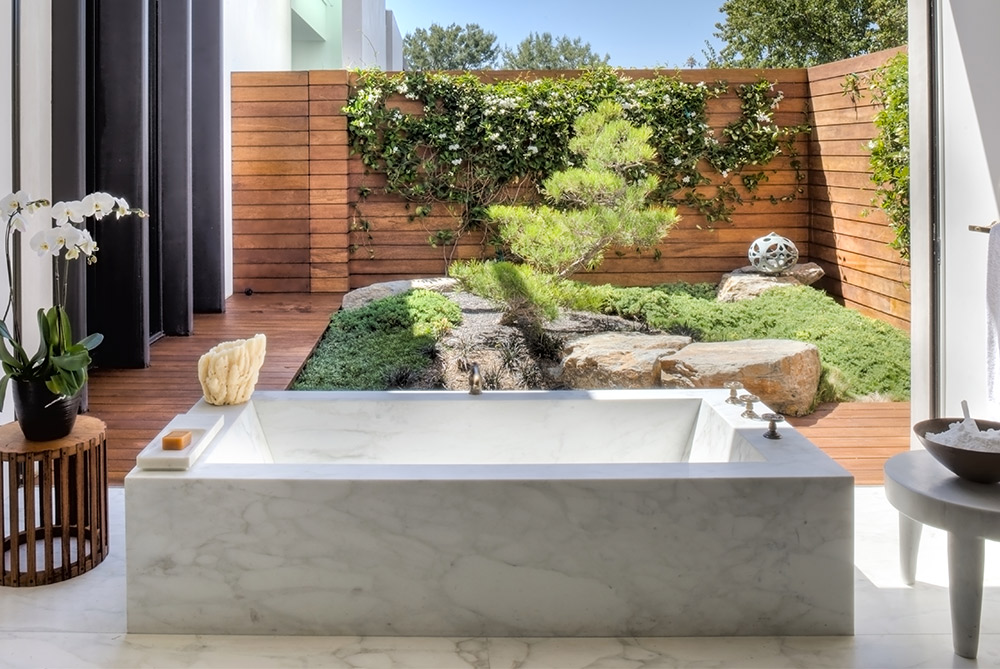
JENNIFER ANISTON’s onetime master bath with a deep stone tub overlooked a Zen garden. Photo by David Glomb.
Also providing a quiet refuge was the master bath with its deep stone tub and a floor-to-ceiling, wall-to-wall window. It looked out on a walled-in Zen garden, which I replicated on the opposite side of the house off the dining room. A press of a button retracted the glass panel to add the sybaritic pleasure of bathing amid soft breezes or a cooling rain from the outside. Lest things get too relaxed, however, I created just off the bath a capacious closet, lounge, salon, and dressing room for fashion fittings, a constant in the life of one of America’s busiest stars.
Unimpressed with her celebrity was a trio whose comfort was paramount: Dolly, Sadie, and Clyde, her dogs. For them, I’d dug into my past and recalled the beanbags I’d made for the first house I’d ever owned in Laurel Canyon. I deviated from the usual teardrop design of these 1960s’ icons and made them in a tall drum shape. Once filled with Styrofoam beads, I could flip them on their sides and they formed a comfortable seat. Covered in fake fur, they were the cat’s pajamas in canine spoiling — or even a spare seat for a human.
When Jen sold the Beverly Hills house, the new owners had asked to buy the entire contents. So she took with her only those possessions to which she had become most attached. That included the dog beds as well as her bedside lamps by Philip and Kelvin LaVerne, Robert Motherwell’s A Throw of the Dice, #17, a sculpture of a 16th-century Chinese deity, and a striking bronze figure of a crane, lit from within.
Jen was quite fond of the crane, giving it a place of prominence in both homes. I later found out that, in Asia, the crane is considered a mystical and holy creature, representative of justice, good fortune, happiness and eternal youth. It sounds to me like a good symbol to keep around wherever you find yourself in life. But especially if you find yourself in the insistent glare of Hollywood stardom.
• • • • •
RYAN MURPHY’s former home in the Pacific Palisades featured steel casement windows and doors throughout. Photo by David Clayton Miller.
PATH OF DESIRE
Ryan Murphy’s home, Pacific Palisades, California
In the fall of 2013, I got a call from a close friend. “My God, Stephen,” he said, “the set for The New Normal looks like a house you designed.”
I tuned into the sitcom about a gay couple raising a family and, sure enough, I recognized it as the Bel Air house I had renovated for Diane Keaton five years earlier. There were the same vintage tiles in the kitchen, the courtyard in front of the house, and a living room that nostalgically evoked a train station waiting room.
The producer-director Ryan Murphy had chosen to film his new series in the house that had remained just as Diane left it. I decided to write Murphy a note expressing my delight and also to register my admiration for his other groundbreaking work, which by then included Nip/Tuck, Glee and American Horror Story. I received no response.
Grand in size, the kitchen retained elegant, minimalist elements, such as a mostly white and slate color scheme, a simplified window treatment and barely there drawer pulls. Photo by David Clayton Miller.
However, three years later, Ryan and I stood in the kitchen of his Beverly Hills home on Roxbury Drive — another house on which Diane and I had collaborated and which he’d purchased from her. He’d called to gauge my interest in working with him on a new house he’d just purchased.
After visiting the site, he’d invited me to join him at the home he shared with his husband, David Miller, and their two kids. I hadn’t been there since Diane had left and everything was much the same. I reminded him of the note I’d written after seeing The New Normal. He led me to a bulletin board in the kitchen. There, pinned in the middle, was my note. He’d saved it all this time.
That gesture gave me an inkling of the man I was dealing with, one with a steel-trap mind, a feverish creativity, and a superhuman attention to detail. “All good things come from detail,” he said. Those qualities had led him to the pinnacle of power in television, a scrappy fighter in a business not for the faint of heart. Now he and I were in the process of the delicate dance every designer does with a prospective client: how far to go in terms of a renovation?
Ryan Murphy was highly sensitive to design, form and theme, and he loved rigor
Ryan led, of course. But the house in question was very much a blank slate. It was a huge and ungainly structure built in the 1990s on a sizable parcel in the Pacific Palisades. Ryan had already begun to strip its 10,000 square feet of large rooms with high ceilings to the bare bones. With the preservation of the footprint of the house as the only mandate, there was every indication that this was to be a near-total architectural restructuring.
When I came into the picture, there were a couple of existing elements that provided inspiration. Ryan had already begun placing enormous steel casement windows and doors throughout the house. This aesthetic, typical of the homes of the 1920s, gave the house a powerful and timeless solidity. Generations to come would be looking out those windows, I thought.
This particular enclave in Pacific Palisades, however, is rich in history, with no street lamps or sidewalks and the clip clop of horse’s hooves in a country atmosphere just off of Sunset Boulevard. So I nodded in assent when Ryan, in his usual infectious manner, mentioned The Big Valley, the 1960s Barbara Stanwyck TV horse opera, as a launching point.
He wasn’t talking of the Victorian mansion over which she lorded, but rather its lush, romantic, and epic sweep. It brought to my mind a term, grounded fabulosity, which was used to describe Ryan in a New Yorker magazine profile. He admitted to the writer that his taste was “baroque,” not in the ornate sense of the word but meaning that he took “a maximalist approach to storytelling.”
This was evident in his total love of process. Whatever I sent to him was carefully considered and analyzed. Such was the case with the book on the architect Irving S. Gill, which I felt could be an important lodestar for the project. A modernist take on Spanish Colonial revival, Gill’s métier was simplicity, restraint and a rigorous adherence to rules.
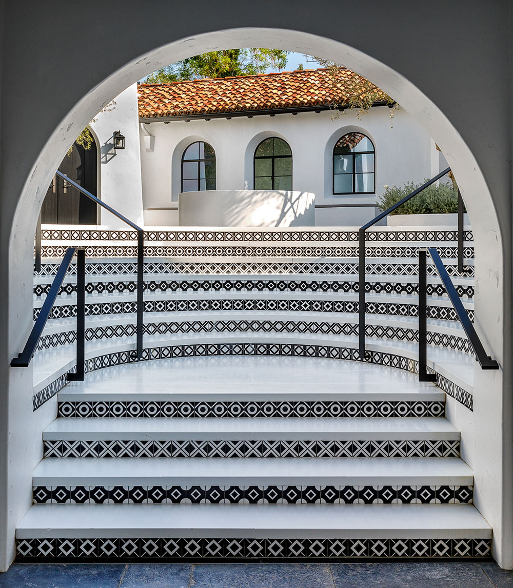
To make the entrance more easily navigable and establish a sense of flow, STEPHEN SHADLEY designed an amphitheater that led to the courtyard and front door. Photo by David Clayton Miller.
Beauty emanated from shapes and graphic silhouettes, and the surfaces and materials would be limited: white stucco, dark oak, black stone, wrought iron. It might seem a stretch that someone with a maximalist approach would respond to such an ethic. But Ryan was highly sensitive to design, form and theme and he loved rigor. He immediately recognized Gill’s playbook as a way to bring symmetry and clarity to the disjointed architecture.
Nowhere was application of this aesthetic more essential than at the problematic entrance. It was quite a trek from the road to the front door and a disorienting one at that. You had to navigate a series of awkward steps through a tower that was off the axis from the main house and which then led into an unappealing courtyard. The challenge was to make sense of it spatially by creating what architects refer to as “a path of desire,” an engaging and pleasurable sense of direction, as innate to people as to animals.
To establish a sense of flow — literally and figuratively — we were both enthused over the idea of fountains, as many as possible. I designed parallel, 30-foot long rectangular fountains leading visitors to the tower which held guest rooms, a bar, and a bathroom. Once through that passageway, I added a round courtyard fountain on the same axis as the tower to serve as a focal point. Since the front door was askew from that line of vision, I suggested to Ryan an all-encompassing semi-circle of steps — an amphitheater, if you will — which would lead to the courtyard and provide an easily navigable “path of desire” to the front door. He said, “No.”
Coming into the process as a director, Ryan was always quick, decisive and intensely organized. I got the answers I needed, if not necessarily the answers I wanted. I took it seriously when he fought against my ideas. After all, this was a guy who was expert at evoking a period. You only had to look at the hotel and asylum in his American Horror Story. When a client rejects a proposal, I can often rethink it and come up with another version. In this case, however, I felt this architectural element was a strong solution to the entrance. I persisted. And he pushed right back.
“I know you think it’s a bad idea, but the entrance sets the tone and the steps will tie everything together spatially,” I explained. I sensed him weakening. It was not something he did often so I bided my time, looking for any opening to press my case. Finally, he said with some exasperation, “Okay, Stephen, go ahead and do your amphitheater.” My stubbornness was eventually vindicated. I smiled to myself when I later heard he’d said to Beth Cowan, our project manager, “I fought Stephen so hard on this and he prevailed. And he was right.”
Like Diane, and unlike some clients, Ryan never deviated from the ground rules we set down. So as the project developed, it took on that classic modernism which had made Irving Gill such a celebrated architect. The simplicity extended to the multiples of fireplaces grandfathered into the house and the arches that we refined to establish a unity as you went from room to room.
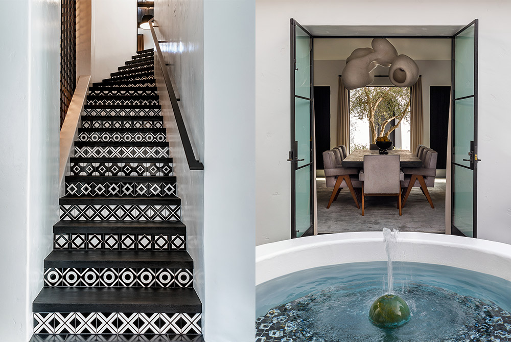
Left: Black and white tiles made for a bold graphic design. Right: STEPHEN SHADLEY and RYAN MURPHY were both keen to add as many fountains as possible. Photos by David Clayton Miller.
Ryan had a fondness for the fireplaces at the Roxbury house so we re-created those and used the same brick — Diane’s long sought-after “perfect brick” — on the terrace and in other parts of the exterior.
The graphic quality associated with modernism was most present in the risers to the steps. They were typically multicolored in old Spanish Colonial homes but when I suggested that the design be in black and white and gray, Ryan one-upped me: “Let’s just do black and white,” he said. It made for an appealing, if extremely graphic design. I did five different versions of the simplest geometric angles I could find and we alternated those throughout the house and in the exterior. It made for a “wow” effect.
The white stucco walls, dark oak beams, and black stone floors gave the house an almost monastic feel, a purity emphasized by Ryan’s insistence that the walls remain unadorned by art. It was less Barbara Stanwyck and more ecclesiastical, which wasn’t surprising since in the New Yorker article, Ryan had expressed his youthful ambition to one day be Pope.
The truth of the matter is that for all the indications Ryan gave of being the powerful television mogul he most certainly is, he could also surprise me. At one point early in the process, as we were surveying the structure, he suddenly piped up, “You know what? I’ve always wanted a great laundry room!” And that is how a laundry of epic scale came to the Pacific Palisades. Who would have thought his grounded fabulosity would extend to laundry rooms?
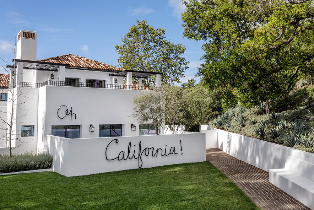
A lyric from a JONI MITCHELL song adorns the courtyard walls. Photo by David Clayton Miller.
The more expected variant on that fabulousness came when we were examining fonts for a gigantic black wrought-iron M to place on the exterior white stucco wall off the bedroom. It was Ryan’s nod to Diane’s love of graphic imagery, an example of which was the steel we’d bent and forged to form the address, 820 Roxbury Drive, on the house he’d purchased from her. As we looked at fonts, Ryan had another idea. “What about putting, ‘Oh, California!’ on the courtyard wall?” he said with that Murphy gleam in his eye. It was from a song by one his favorite artists, Joni Mitchell. “Oh, California / Oh will you take me as I am? / Will you take me as I am? / Will you?”
Ryan had chanced on the perfect epilogue for our monumental undertaking. With its 30-foot bubbling fountains, looming amphitheater entrance, massive wood doors, and pure white walls, there was a monumentality that fused the past with the future. Looking at it, I could trace a line from Flash Gordon to Oz to Metropolis, all those cinematic visions fixed somewhere between earth and pure imagination.
That is what my collaboration with Ryan had been — as with my other clients who’d been driven to tell narratives on screen and, as well, through their homes. What a privilege to have indulged in those fantasies with them. A dream factory in and of itself. “Oh, California!” Indeed.
Excerpted and adapted from Designing Hollywood Homes: Movie Houses ($65, Rizzoli New York) by Stephen Shadley with Patrick Pacheco, featuring a foreword by Diane Keaton, out Oct. 6, 2020.
Feature image: DIANE KEATON’s onetime residence, designed by STEPHEN SHADLEY, in Beverly Hills. Photo by Scott Frances.
Oct. 2, 2020
Discover more DESIGN news.


