Cameron Smith helped shape the homes of Jennifer Aniston and the Olsen twins, but what about the one he saved for himself?
Photography by BILLAL TARIGHT
Words by MARTHA HAYES
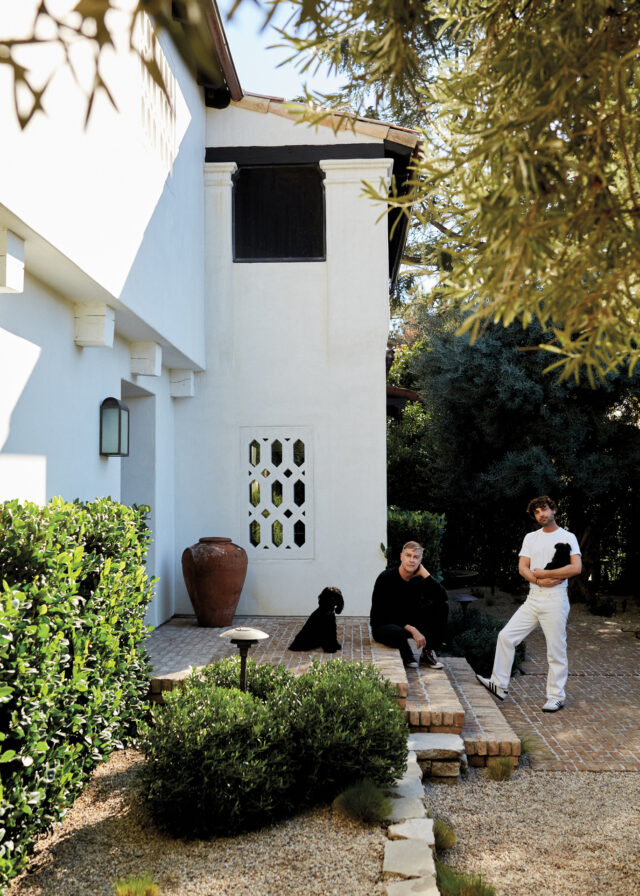
Cameron Smith (left) and husband PJ Faulstick with their dogs (from left), William and Rupert, standing in the garden created by landscape designer Scott Shrader. “Scott changed everything,” Smith says. “He gave us rooms outside. It’s enclosed with green hedges and tables and chairs, and we are always out there.”
The enclosed balcony off the primary bedroom in the 1928 Spanish Colonial home in Pasadena that antiques dealer Cameron Smith shares with his husband, design consultant PJ Faulstick, has proved so popular with guests that it now has its own name: the perch.
With its dark-beamed ceiling and beautiful dimmed lights (thanks to Poul Henningsen wall sconces), the inside-outside space, which features Japanese teak chairs and a 16th-century stone slab table, sits up to nine people. “When we have people over, everyone ends up there,” explains Smith, cofounder of Galerie Half on Melrose Avenue.
Hosting is a frequent occurrence for someone as connected and coveted as Smith. His visionary gallery turned store has been attracting A-list clients — including Jennifer Aniston, Mary-Kate and Ashley Olsen, and Ellen DeGeneres — since it opened in 2009. Flammarion recently published Galerie Half: Selected Work Spaces ($125), a lauded retrospective of the midcentury design masterpieces he has curated over the years.
Within Smith’s home, just like in his store and evidenced through his new book, is a harmonious juxtaposition that defines the Galerie Half style, such as a Persian Bibikabad rug draped over a Clements Design custom linen sofa in the living room or carved Bamana Jonyeleni figure from the 1930s on top of a contemporary black Axel Vervoordt table. “It is just furniture at the end of the day, but also there are a million opportunities to do something that simple incorrectly,” he says.
“We have a lot of friends who want to come over and stay the whole weekend,” he says. “PJ is the cook and really gets into it, hitting the right farmers’ markets two or three days before. We never did this in our last house.” No one is more surprised than Smith, a Mulholland Drive resident for eight years, by their friends’ willingness to make the journey to Pasadena.
“They have to travel five times as long,” he says. “I never intended to move to Pasadena. You could have said, ‘Do you want to move to Oklahoma or Pasadena?’ Because they’re both that far away in my head. When PJ took me to look at houses, I was like, ‘It’s never going to happen.’ ”
The energy was perfect. The house didn’t need to be changed; it just needed to be updated.
CAMERON SMITH
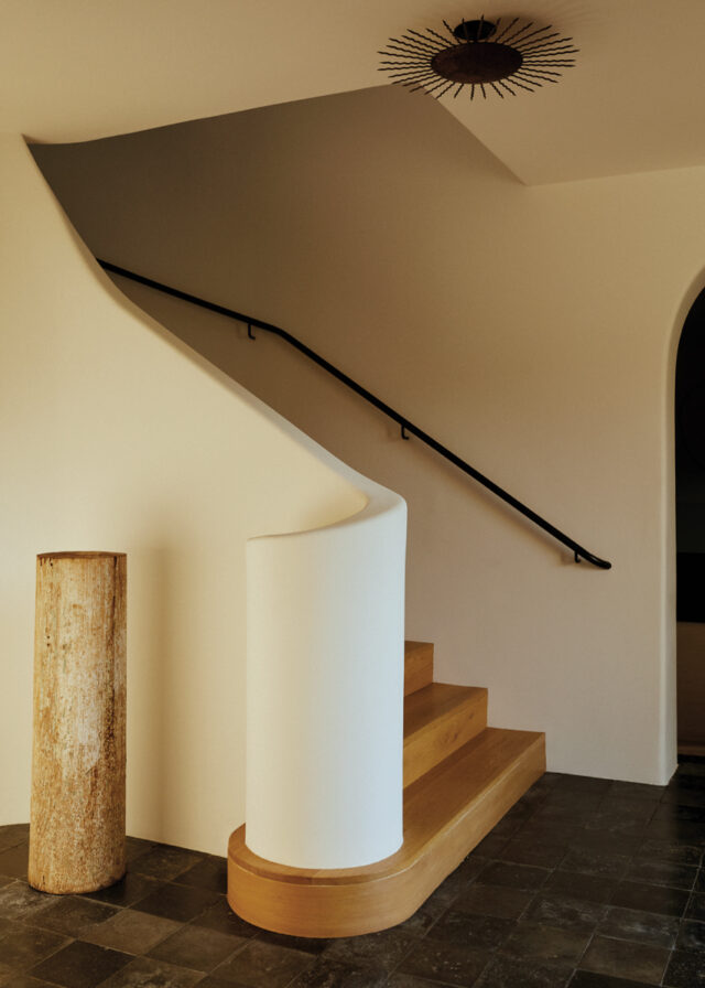
Clements Design opened up the house with skylights, including one above the stairwell: to the left of the stairs is an 18th-century Swedish pedestal, and a 1930s French gilt-iron light fixture hangs from the ceiling.
What changed? “The frustration of what’s happening in L.A. with house flipping and the destruction of some of the most beautiful buildings,” he says. “Our history is being wiped out to make a dollar. We were only finding houses with white marble floors and LED lights and everything else that’s terrible. We would have had to pay to clean up someone else’s mess.”
As soon as Smith laid eyes on this un- touched property, with its stucco walls and arches, the search was over. Located a mere 11 miles from downtown L.A., it has an out-of-town serenity thanks to a scenic backdrop of the San Gabriel Mountains and an abundance of 100-year-old olive trees.
“The owner passed away and her niece was selling it, but she was holding out because everyone wanted to change it and take the Spanish out,” he says. “There was love there; the energy was perfect. It didn’t need to be changed; it just needed to be updated. I grew up in adobe houses in Santa Fe. That’s what I wanted.”
The main structural issue was too many rooms. (“In the 1930s, there was a room for everything. There was a room for gloves!”) The couple didn’t need that many rooms, nor did they want an open concept. “It just needed air to breathe,” says Smith.
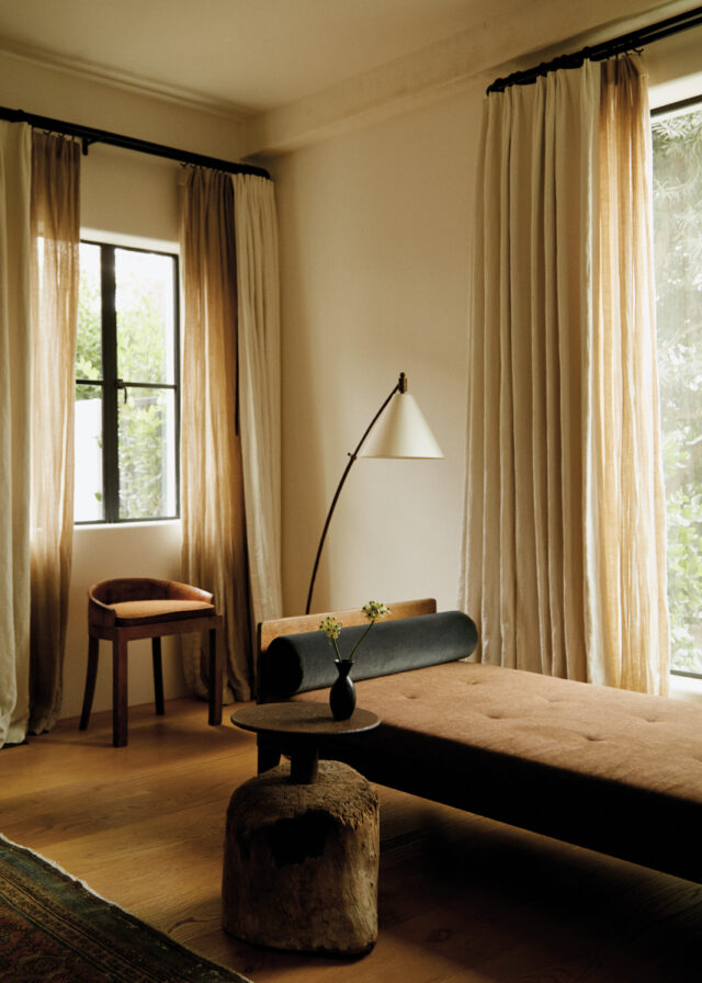
A Jean Prouvé daybed in the living room.
Essential to the renovation, which took three and a half years to complete, was bringing on Clements Design, the L.A.-based mother-and-son duo (Kathleen and Tommy) whose clients include Jennifer Lawrence and Kendall Jenner. It was a no-brainer — Smith has known the designers since before they started their company — but he was still overwhelmed by the result, which includes skylights to bring light into the stairwell, primary shower, and dressing room.
“That really changed things because there were gloomy parts of the house and now this gorgeous light pours down,” says Smith, who also enlisted the help of celebrated landscape designer Scott Shrader to create alfresco spaces functioning as additional rooms.
“It’s simple, clean, and beautiful. The Clementses gave me a furniture floor plan at the start, which all designers should do right away,” he says. “I knew it wasn’t going to happen overnight, so that allowed me time to gather some of the more intimate pieces.” Smith has been sourcing since he was a child. His mother, now 92, was an interior designer and instilled in him an eye for design.
“We all had our jobs to do, and once they started to see the pieces, it made everything they included, like the drapery, make sense. Even my mom, who walked in and grabbed as much as she could in one hand, was like, ‘They’re good.’ She knows. There is a difference between just curtains and thick draping curtains that are meant to fall in a certain way. Things like that, I never would have been able to do. We all put in our own ingredients.” Smith’s ingredients are antiques he has sourced, pieces anyone who has walked into Galerie Half and felt inspired by his curation would recognize immediately.
I knew the renovation wasn’t going to happen overnight, so that allowed me time to gather some of the more intimate pieces.
CAMERON SMITH
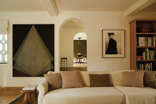
A custom Clements Design linen sofa in the living room. On the wall (from left) are Veladura Nocturna, 2018, by Mexican artist Gonzalo Lebrija, and Game Keeper, a 2004 photograph by Collier Schorr. “I’ve always been drawn to photography,” says Smith. “I like fashion photography, but people who are creative like Collier and shoot by proxy are special.”
Like buying a house in Pasadena, Smith never planned to publish a book. “The pretense of doing a book about yourself or your own store seems very ego-driven to me,” he says. He was persuaded after a conversation with Trevor Cheney, a designer working at Galerie Half who introduced him to Lena Winkler at Studio Small, who collated all the images. “Once I saw her perspective, I was like, ‘Oh, they’re like puzzle pieces of art,’ and that made it special.”
When it comes to specific pieces for Smith’s own home, less is more. His personal collection includes Native American sculptures and ceramics that belonged to his parents (“My mom didn’t have one kachina doll; she had 70. I’m very different. I just have one”) and carefully curated artworks that include Veladura Nocturna, 2018, by Mexican artist Gonzalo Lebrija and Game Keeper, a 2004 photograph by Collier Schorr.
But the anchor of the house is a full-length oil portrait of a young boy by Owe Zerge that is mounted next to the fireplace. It’s a particularly valuable painting Smith persuaded a client and friend to buy in 2003 — only for the individual to give it back to him as a generous housewarming present. “It has a beautiful representation not only as a piece of art but also as a piece of friendship,” he says.
Who was the friend? “Oh, just a famous, funny lady,” Smith says. He is, after all, as modest and unpretentious as Galerie Half — and the perch where he entertains — itself. “She cracks me up on the daily.” Does she have a house in Montecito? “She just might,” he says, laughing.
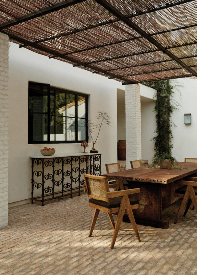
Pierre Jeanneret chairs surround a dining table on the patio.
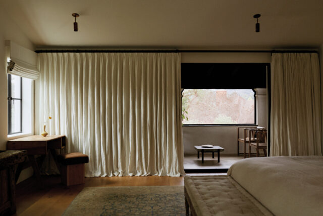
The bedroom features an early-18th-century Gustavian bench at the foot of the bed. By the window sits a 1960 teak student desk by Pierre Jeanneret and an oak and cashmere stool by Green River Project.
Feature image: A pair of original midcentury Ib Kofod-Larsen Seal Lounge chairs are positioned at both sides of the fireplace in the living room. “They are incredibly comfortable,” says Smith. “I don’t say luxurious often, but it does feel like that when you’re sitting on them. At the same time, they’re not precious, just beautifully designed.”
This story originally appeared in the Spring Men’s Edition 2024 issue of C Magazine.
Discover more STYLE news.
See the story in our digital edition


