Of course it took five years for the product designer to build his own place
Words by DAVID NASH
Photography by FRANCOIS DISCHINGER
Fashion Direction by LAUREN GOODMAN
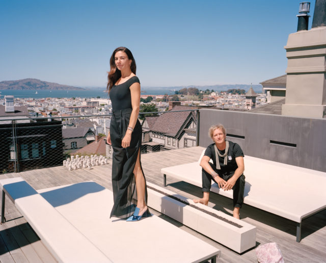
Buell and Béhar on the deck outside their bedroom, perched atop custom heated benches designed by Béhar for Galanter & Jones.
Situated in a desirable enclave of San Francisco’s Pacific Heights neighborhood—on one of those dauntingly vertical streets that challenges even the most experienced drivers—sits something of an ultra-modern jewel box among the tightly arranged, mostly classical revival-style homes. And while it’s not uncommon to cross paths with this type of architectural evolution in the city, it’s another thing to see it done properly: with intention, not ego.
This particular home—a quiet monolith of sorts—is one of those intentional dwellings that showcases all the natural elements of its construction in the best light, without any unnecessary or glaring architectural elements to detract from its original purpose. Such is the work of the homeowner, Swiss-born industrial designer Yves Béhar, who spent the better part of five years designing his family’s four-level open-concept home. “When we bought the house over 10 years ago, it was too small for our family,” says Béhar. “It was a long process because I really designed every little bit of it. We lived in Sabrina’s loft for almost five years during construction—all stacked up in one bedroom—before moving in.”
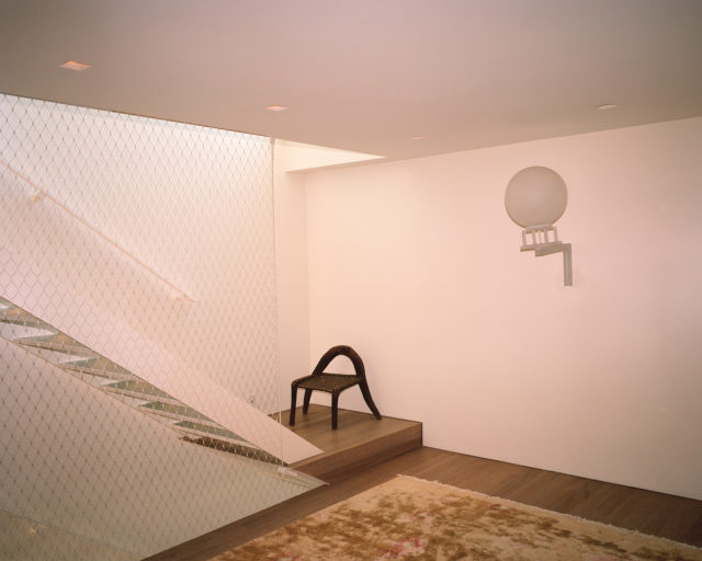
Less is more on the third-floor landing that connects the children’s bedroom to the office and leads upstairs to the primary bedroom.
The shelving that spans the back wall was designed by Béhar to minimize sun fading to their collection of books.
What once stood on the seemingly compact 3,123-square-foot lot—a traditional three-story, wood-clad home built in 1949—has been replaced by the family-forward compound that Béhar shares with his wife, art consultant Sabrina Buell, and their four young children. “His focus was really on open spaces for all of us to be together,” notes Buell. “I mean, our bedroom doesn’t even have a door on it.” To that end, Béhar strategized how to create the most thoughtful flow possible. “It’s not a big house,” she adds. “He wanted us to feel connected and like everyone could be visible to each other. From our bedroom upstairs, you can look down on the back deck where the kids play; every space, even the openness of the staircase, has these clear sightlines.”
“We bought the house over 10 years ago but we lived in Sabrina’s loft for almost five”
YVES BéHAR
“To me, the concept of a house—at least for me and my family—is that it’s a place to gather and play,” Béhar shares. “Almost every night, and even first thing in the morning, that’s what the kids want to do. So we play backgammon, chess or other card games—my 6-year-old actually beats me at chess. They’re all really good.” That’s why the two bedrooms for the children, which occupy part of the third level, are on the smaller side. “He intentionally made the bedrooms very small for them—and to share—so they wouldn’t want to be in there too much,” says Buell.
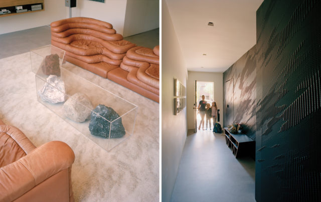
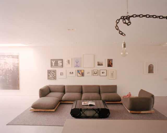
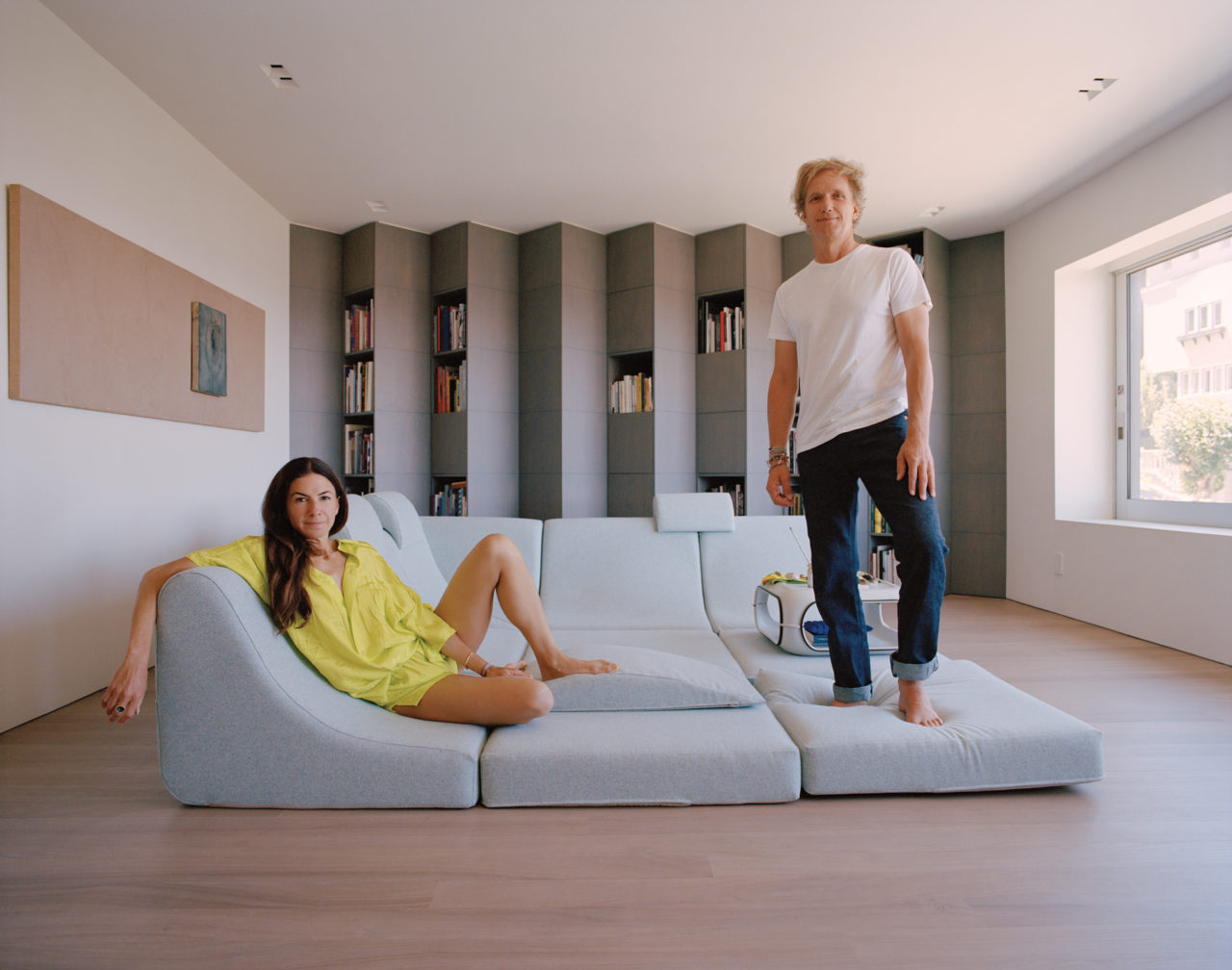
Left to right: Perhaps Béhar’s favorite pieces of 1970s design are the Ubald Klug Terrazza sofas in the living room—a go-to gathering spot for family game nights; the rock sculpture is by Nicole Wermers. Three of the couple’s four children in the entryway of the home, which showcases a wall clad in black anodized CNC-machined aluminum designed by Béhar.
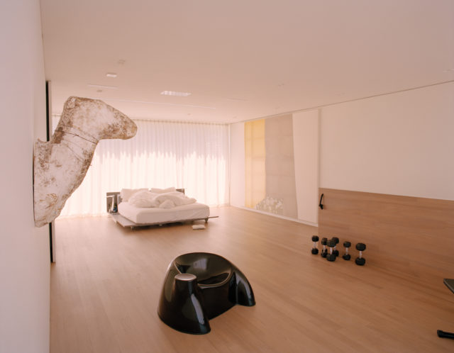
With ample space, the couple’s bedroom often doubles as a screening room—or dance club—for the young family.
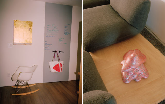
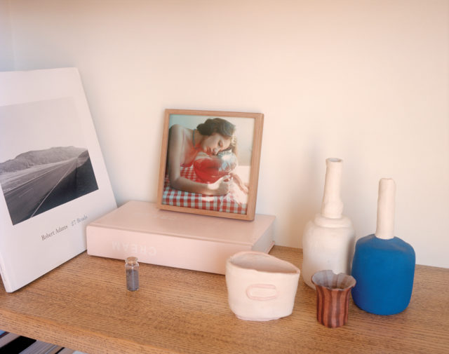
A series of vignettes throughout the home are indicative of the family’s minimal yet eclectic design aesthetic.
Another family living space, adjacent to the kitchen and dining room, is accented by a gallery wall filled with works by artists like John Baldessari, Robert Crumb and Roni Horn.
The home’s interior is not only a reflection of the family’s close-knit dynamic but a showcase for the couple’s two passions: art and design. “We have similar tastes, but where the art is concerned, she’s the one that really studies and pursues it and understands both the context and idea,” asserts Béhar, the 55-year-old designer and founder of fuseproject, the award-winning design and innovation firm that has overseen product design for iconic brands like Prada, Herman Miller, Kodak, Samsung and General Electric—and whose work is in the permanent collections of both The Museum of Modern Art in New York and San Francisco Museum of Modern Art. “For me it’s always a surprise, and welcome dialog.” Yet, as Buell points out, her husband is anything but a novice when it comes to selecting art. “He’s given me pieces which I treasure—Yves has such inherently good taste.” Those gifts include a Hiroshi Sugimoto photograph of the Castro Theater and an artist’s proof of Man Ray’s mixed-media work Trompe l’œuf. “Design and art complement each other just enough, so our worlds overlap, and we learn from each other.”
As for Béhar, he’s been able to work an obsession with 1970s design into most spaces throughout the house. “To me, [the era has] always been expressive and sometimes even political,” he explains. “There was this notion in the ’70s that society was changing, so the traditional norms of engagement—whether that was in a kitchen, a dining room or a living room—were being challenged. Designers of that period like Ubald Klug and Enzo Mari were really thinking about new ways people could engage with each other that [weren’t based on] formality, or traditional couch-and-coffee-table layouts.”
The overall result is an unpretentious, comfortable space that vibes with the family’s laid-back lifestyle, complete with a highly coveted pair of vintage Klug Terrazza sofas that serve as a welcoming spot for guests or a competitive game night with the kids. It also lends itself to special events hosted by the couple, who are avid supporters of the arts. Once, it was even turned into an immersive installation by performance artist and choreographer Adam Linder and the Wattis Institute for Contemporary Art. “He activated the entire house with dancers,” says Buell. “His pieces are all about labor, and how [we] paid to hire him to, in turn, hire dancers for the performance, and in the end the only [tangible piece of] artwork was a signed contract for the labor that we framed.”
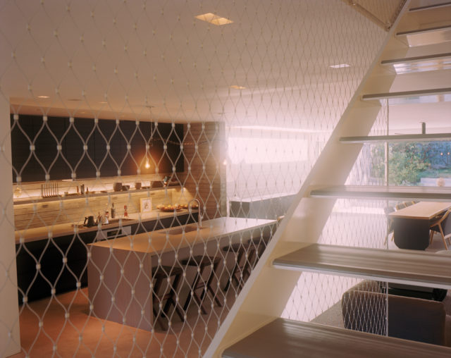
From the staircase leading to the third level, and through the Jakob rubber mesh “fencing,” is a view into the open-concept kitchen and dining space.
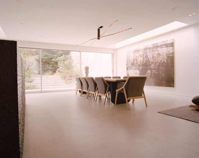
The family’s dining room features a large-scale work by Hugh Scott-Douglas.
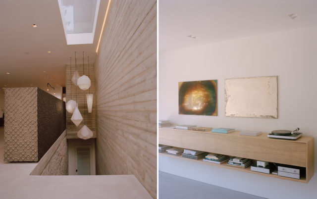
Left to right: Amplify pendant lights designed by Béhar for Swarovski hang above the entrance to the lower-lever guest suite. To the left of the staircase is a console of anodized CNC-machined aluminum with a waterdrop motif, also designed by Béhar. A diptych by artist Michael Part reflects light above the custom-built shelving in the living room.
“His focus was really on open spaces. Our bedroom doesn’t even have a door”
SABRINA BUELL
The couple’s shared passion for the arts has manifested itself in a number of ways in recent years, including Béhar’s design for the installation of Bay Area artist Ron Nagle’s 2020 exhibition, “Ron Nagle: Handsome Drifter,” at the UC Berkeley Art Museum and Pacific Film Archive. They also actively support several other educational and cultural institutions, like the San Francisco Museum of Modern Art, where Béhar currently serves as a trustee.
In fact, their home feels somewhat like a rotating installation, filled with meaningful mementos from family trips and an ever-changing selection of artwork. “It’s always evolving—and all of it is deeply, deeply personal,” Buell says wistfully. “Like the baby rattle that [artist] Tom Sachs made for us when one of our kids was born and figurines collected from trips to Indonesia—it’s all the personal stuff.”
Considering for a moment how his wife, like a true gallerist, moves artwork around on a regular basis, Béhar offers a last bit of commentary about how they view their world. “When you get attached to things, you can take them for granted—even if they’re beautiful and perfect in the space. So, in order to not lose appreciation for those things, I believe we have to use change as an instrument for keeping them fresh.”

Feature image: Stone-carved Timor people statues keep many watchful eyes on the home from the deck off the bedroom.
This story originally appeared in the Fall 2022 issue of C Magazine.
Discover more DESIGN news.
See the story in our digital edition

