After two years of paring down her famously maximalist Beverly Hills manse, the designer welcomes C into her reinvented personal space
Words by ELIZABETH VARNELL
Photography by THE INGALLS
“This is my lab,” says Kelly Wearstler of the 1926 Georgian-style house she has famously slathered in vibrant Technicolor paint, wallpapered in strikingly clashing patterns, and filled with miles of metals and marble in the 14 years she and her husband (real estate developer Brad Korzen) and their two teenage sons have lived here.
But over the course of two years, the Los Angeles-based interior designer, known for her fearlessly irreverent juxtapositions (think elements of Hollywood Regency glamour, streamlined midcentury design, layered Tony Duquette collages, David Hicks’ graphic patterns and moody brutalism), entirely reworked the Beverly Hills residence.
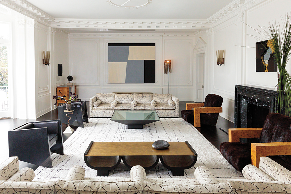
Gone are the bold vermilion and wisteria pieces documented in her vibrant 2009 volume Hue and the heavy metals of 2012’s Rhapsody. Floor-to-ceiling white walls now draw the eye to the house’s intricate wood moldings, and Wearstler reveals that the millwork throughout the residence is a single shade. “It’s not a rule,” she quickly clarifies: “I totally mix whites.” But with all the natural light bouncing off the newly cleared walls, she finds the uniformity calming. “It feels like heaven: grounding and relaxing,” says the South Carolina native.
“With a more minimal design, each piece truly has its own voice”
Kelly Wearstler
Over the past 24 years, her eponymous firm has put its mark on private residences (Gwen Stefani and Cameron Diaz are clients) and on hotels in Korzen’s portfolio — from boutique locations (namely the Avalon Beverly Hills and a number of Viceroy properties, which launched Wearstler as the West Coast’s authority on modern glamour) to, more recently, historic buildings in San Francisco and Santa Monica repurposed into Proper Hotels with chef-driven restaurants (with Austin, Texas, opening this winter and Downtown L.A. slated to launch in the new year).
So what prompted her latest pivot? Its origins can be traced to when her landscaper, Art Luna, took to the grounds of her 3.2-acre estate — originally concepted by architect James Dolena — after a pool redesign. The hairstylist turned garden designer, who uses his precise approach to tame foliage for Lisa Eisner and a host of other high-profile clients, brought new order to the property.
“This whole thing started with the pool and Art,” says Wearstler. Once the rectangular white-tiled swimming hole was complete, Luna’s manicured topiaries arrived. Boxwood globes and oversize platforms filled with the shrub cut to a height of precisely 18 inches added site-specific structure to the garden. “We kept it simple and low and it ended up being minimalist,” says Luna. “If you’re just conscious of the negative space and allow sky and light to come through, that’s half of design.”
The open spaces between the greenery surrounding the pool and the house’s interior courtyard struck a chord for Wearstler and her older son, Oliver, who was lobbying for a clean break inside too. “He asked for an all-white room,” Wearstler says, “and painting it made the architecture sing. Two years later, the entire house is white.”
“Kelly and I both have a tendency not to follow the rules”
Art Luna
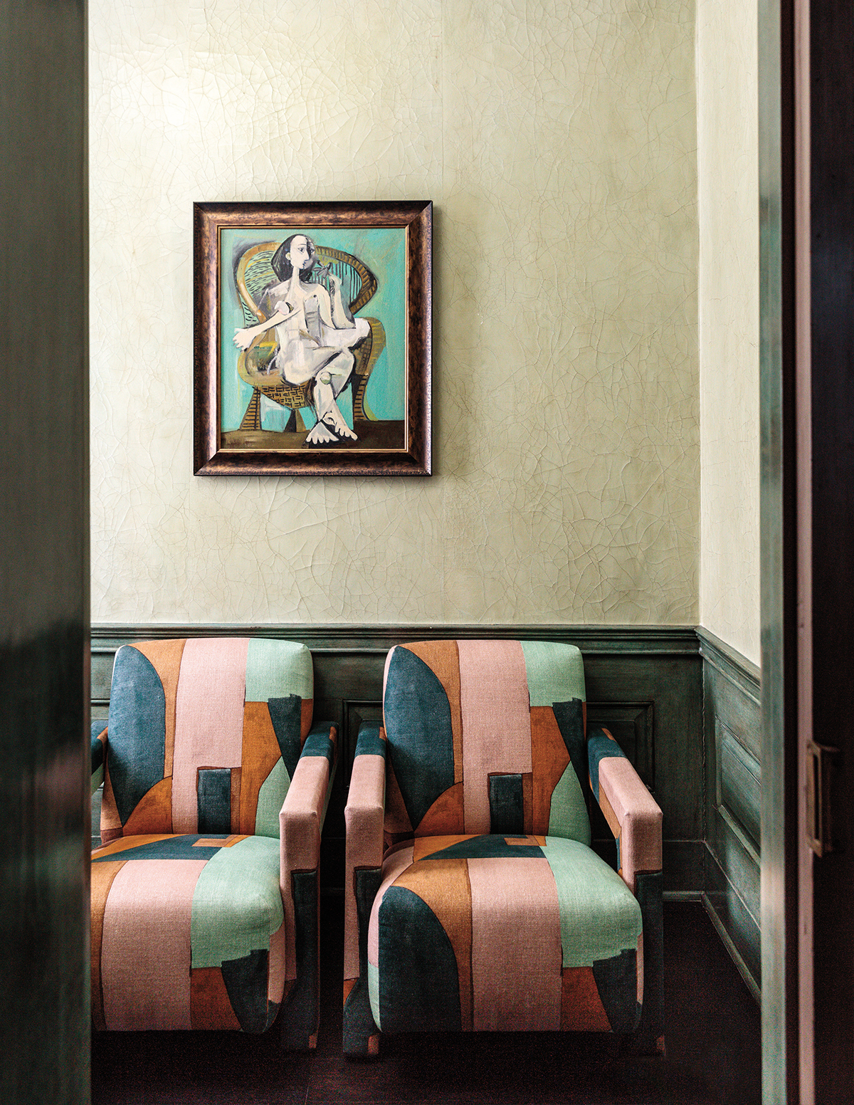
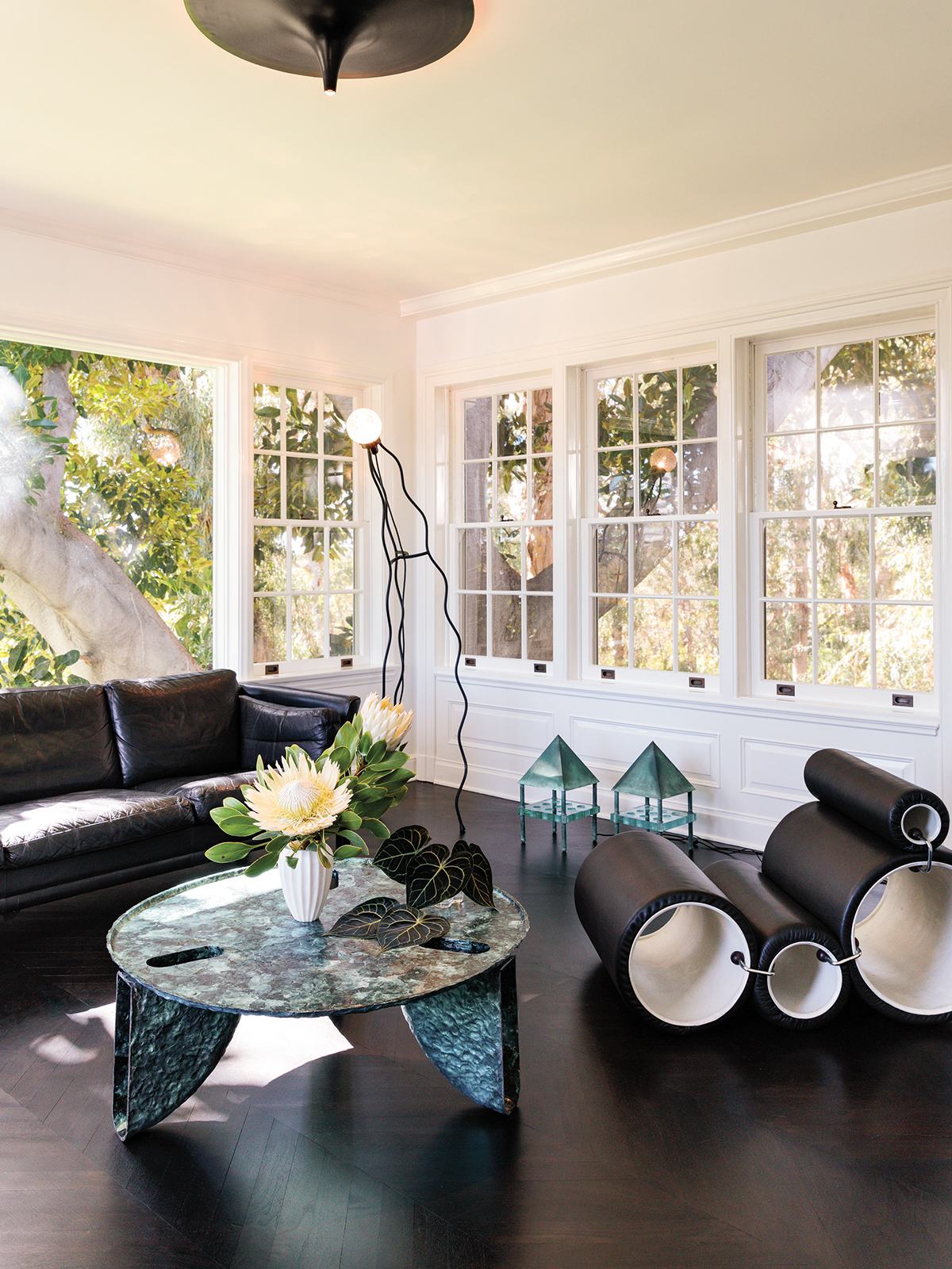
She still loves the residence’s former maximalist look and the process of gathering art and furniture from years of travel, but both boys’ reworked rooms spurred her to unify the rest of the house with a “more pared-down approach.” Work on interiors for a client’s modern house pushed the new aesthetic even further. “With a more minimal design, each piece truly has its own voice,” she says.
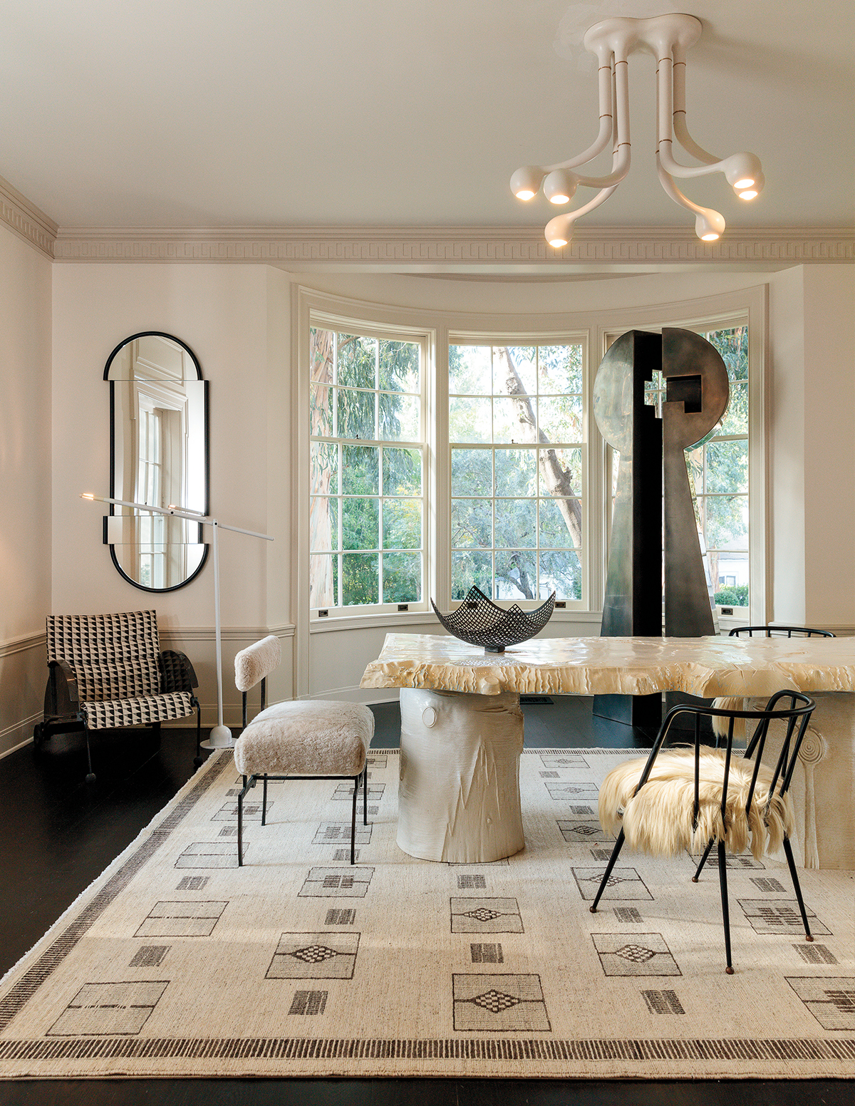
The new austerity heightens Wearstler’s trademark off-kilter style. White walls make a blobby Louis Durot resin mirror in the rotunda, hallway neon light fixtures and a downright quirky Acetone Erosions chair by Susan for Susan in a powder room all even more striking. The latter — sculpted from cement and sand — is truly a case study in Wearstler’s enduring aesthetic.
“That powder room is pretty spot-on to how it looked when we bought the house,” she says; she changed only the floor. But the space seemed to cry out for a new spirit, “something unusual to create interesting tension.” Now the seat, which looks as though it could have been recovered from the bottom of the sea (barnacles and all), stands in stark contrast to the rest of the room. “The architecture is refined and classic, this chair is the total opposite,” she says triumphantly. Through it all, Wearstler continuously revisits her design approach: “Opposites attract and you have to evolve with time.”
Feature image: ART LUNA’s manicured landscaping helped jump-start KELLY WEARSTLER’s minimalist reinvention of her family’s 1926 property. All photos excerpted from Kelly Wearstler: Evocative Style (Rizzoli New York, $55).
This story originally appeared in the December 2019 issue of C Magazine.
Discover more DESIGN news.
