Peer inside the richly layered world of one of Los Angeles’ most in-demand design firms
Words by KELSEY McKINNON
For Amy Kehoe and Todd Nickey, proprietors of the lauded L.A.-based design firm Nickey Kehoe, the title of their debut book, Golden Light: The Interior Design of Nickey Kehoe (Rizzoli New York, $55), could not have been more apropos. In one sense, “it’s about the way we follow the light throughout the day,” says Nickey, who, like Kehoe, resides on the east side of Los Angeles and commutes westward to the firm’s new studio beside their retail shop on the edge of Hancock Park. (Following the sun’s path also echoes the pair’s 2003 move from New York to California when they launched the firm in 2004.)
Fittingly, the book features 15 Los Angeles projects from east to west — starting with Nickey’s Pasadena home, traversing across Los Feliz and Beachwood Canyon to Italianate manses in Hancock Park, a Craftsman cottage in Venice, a former hunting lodge in the Santa Monica Mountains and finally a Rancho-Swedish abode in Santa Barbara’s Toro Canyon.
The cover image — the foyer of a storybook Normandy-meets-Tudor-style estate in Griffith Hills featuring original millwork and a modernist Jean de Merry pendant — perfectly encapsulates the character-imbued world of Nickey Kehoe, where color and prints are expertly layered with the trappings of their cultured clients. And in this way, the idea of Golden Light speaks to the warm humbleness of their cultivated aesthetic. “Any time there is a bit of character, we want to work off of it and not take it away from it,” Kehoe says. “We are lucky Los Angeles has so much of it.”
TODD NICKEY and AMY KEHOE. Photo by Amy Neunsinger.
These days, the pair (with a team of 14) employs a “divide and conquer” strategy for the 15 to 20 projects they have going at any given time. They relish collaborating, which they recently did for the renovation of the Hollywood Roosevelt Hotel’s historic lobby and forthcoming Nancy Silverton-helmed restaurant, along with a line of candles that debuted in September and a collection of wallpapers.
Two decades since they first met and their story began, the time felt right to take stock of the ideas that have brought them this far. As Kehoe explains, “We both were at a place where we were like, ‘Yeah, there is a body of work here. … We have put in a chapter in Los Angeles.’”
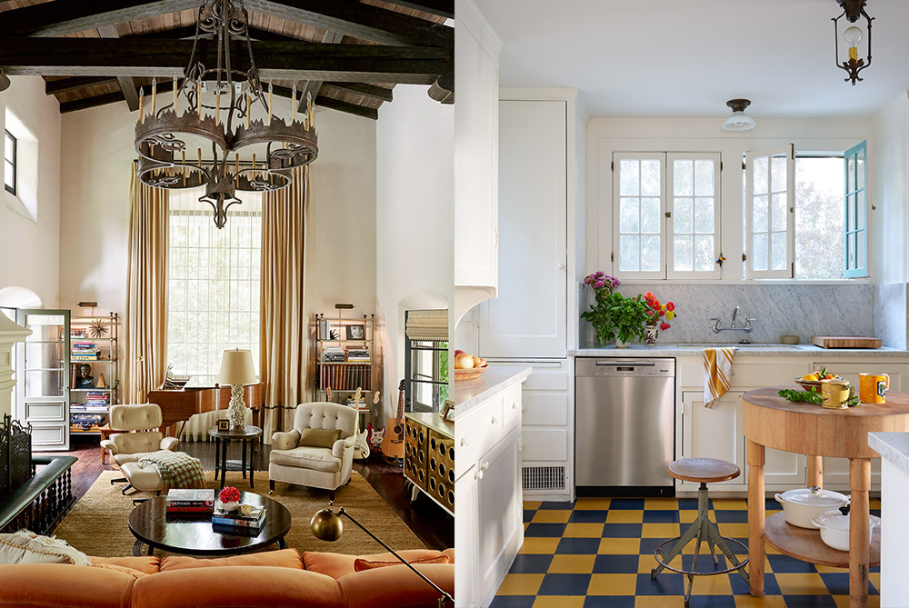
Left: This living room in Wattles Park is home to a vintage EAMES chair and ottoman, a ROBSJOHN-GIBBINGS coffee table and GEORGE SMITH upholstery; photo by Amy Neunsinger. Right: In the kitchen of this Beachwood Canyon home, NICKEY KEHOE added cement checkered tiles for a punch of color; photo by Roger Davies.
Nickey Kehoe’s work is at once “tactile, multitextural [and] curiously imperfect” as they describe it in Golden Light. Here, they share their expert tips on how to pull a room together, the design trends they love (and the ones they are glad to see in the rearview mirror), the boldest request from a client, and how their friendship remains the cornerstone of their business.
“We’re currently digging into England in the early 20th century, layered in with some ’40s/’50s Italian”
NICKEY KEHOE
Nickey Kehoe is widely praised for the ability to layer prints, colors, textures and pieces from different periods. What are some of your tips for making a layered room feel cohesive versus chaotic?
We do love layers and patterns, but also want the eye to be able to settle and see the room. If using patterned wallpaper, maybe try a bolder colored trim on the crown and base molding to frame the pattern.
Are there any specific pieces of furniture and/or decor objects that you love so much that you end up incorporating over and over again in various projects?
The Noguchi lanterns. Lately, we have been finding the fan table from Howe to be incredibly useful in our projects. Our round coffee table is a tried-and-true collection piece as well. The Scalloped Sconce, also a part of our collection, reinvents itself in each home. Zak & Fox Fabrics.
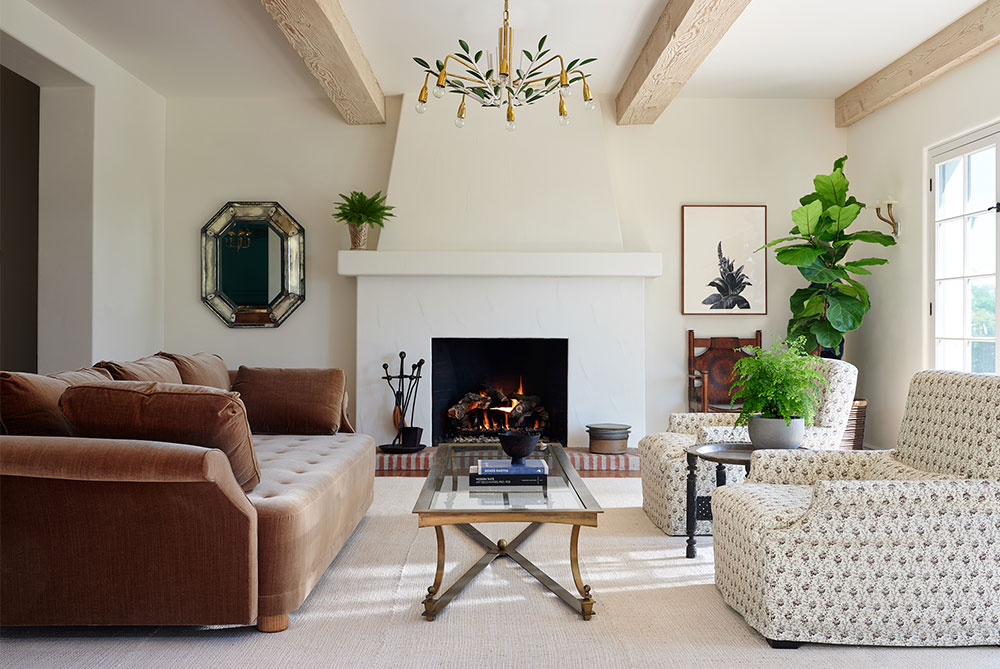
A WOKA LAMPS VIENNA chandelier hangs between sandblasted beams in this bright sunroom in Toro Canyon. Photo by Roger Davies.
What’s the easiest way to make a modern, sterile house feel warm, inviting and lived-in?
Adding in elements from different eras — not being literal about “contemporary” furniture. Wallpaper and rugs can warm up a space as well. Not being afraid of some tchotchkes too. Adding some personal effects can keep things feeling less sterile.
Favorite house plants or cut flowers?
Pannenkoeken plant (Chinese money plant).
Is there a design trend you are on board with currently?
Love that more traditional design and furniture is being embraced and reinterpreted, such as with primitive antiques.
Besides the beautiful Nickey Kehoe shop, what are some of your favorite design resources in California?
Lief, Obsolete, Marc Phillips, Claremont Fabrics, Pat McGann, County, Lum Fardo — this list goes on and on, truly. It’s really amazing to have shopped at these stores and showrooms and call them our friends as well as resources. Because we have the shop, we absolutely buy pieces we love before having a home for them!
Favorite historical design eras?
We are fans of many, but currently, we’re digging into England in the early 20th century … layered in with some ’40s/’50s Italian.
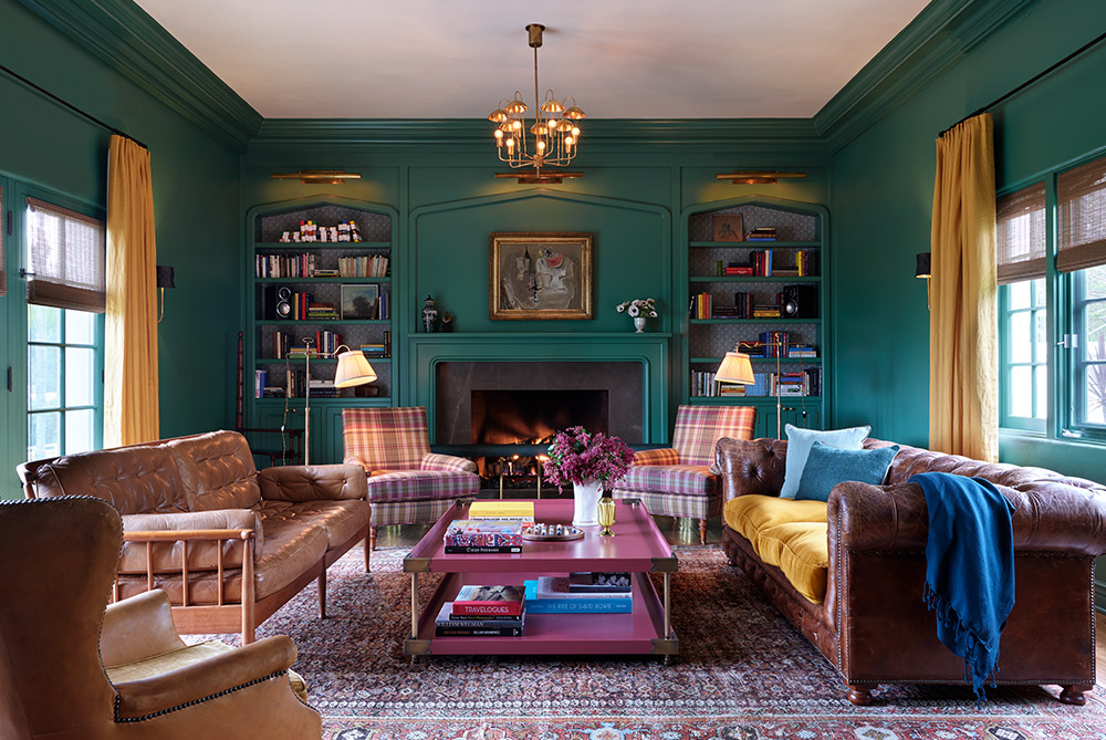
NICKEY KEHOE used a vivid green paint called Ashland from PORTOLA PAINTS on the walls of this Toro Canyon home’s library, a cozy rich space where golden, camel and berry tones mix and match in the upholstery. Photo by Roger Davies.
Craziest design request from a client?
A bathroom sink for a 13-year-old that doubled as an aquarium. Mission accomplished.
Do you have time outside of work to actually hang out? If so, what does that look like?
We do spend lots of time together, especially lately. Todd’s pool has been a big spot for us this summer. We took a road trip to Sonoma to pick up my puppy this summer, stopping in Stinson Beach and St. Helena along the way. Our vintage buying trips tend to be the time we get together to really “catch up” and explore and be inspired. We both look forward to our trips sooooo much.
Feature image: In a NICKEY KEHOE-designed residence in Toro Canyon, JENNIFER SHORTO’s Mini Cities wallpaper serves as a whimsical backdrop for the vintage rattan French beds. Photo by Roger Davies.
A version of this story originally appeared in the Fall/Winter 2020 issue of C Magazine.
Discover more DESIGN news.
